01 — Context
The problem was
deeper than performance.
CVC is Brazil's largest travel company — 1,600 stores, 30M customers, R$17B in annual bookings. The app had a 2.0★ rating and the mobile team was treated as a backup to the website. No native experience, no GPS, no fluid interactions. The entire booking flow ran on webview.
I was the solo designer on the project, working with 25 engineers, 2 PMs, and 2 Tech Leads. Existing research pointed to the symptoms. My job was to find the root cause and propose a plan stakeholders would actually say yes to.
02 — Root cause
Webview treated as backup.
No reason to install the app.
Most 1-star reviews cited freezing — not design. The entire booking flow ran on webview inside a native shell. No GPS, no haptics, no native rendering. Users had the same experience as the website but worse. There was no reason to install the app at all.
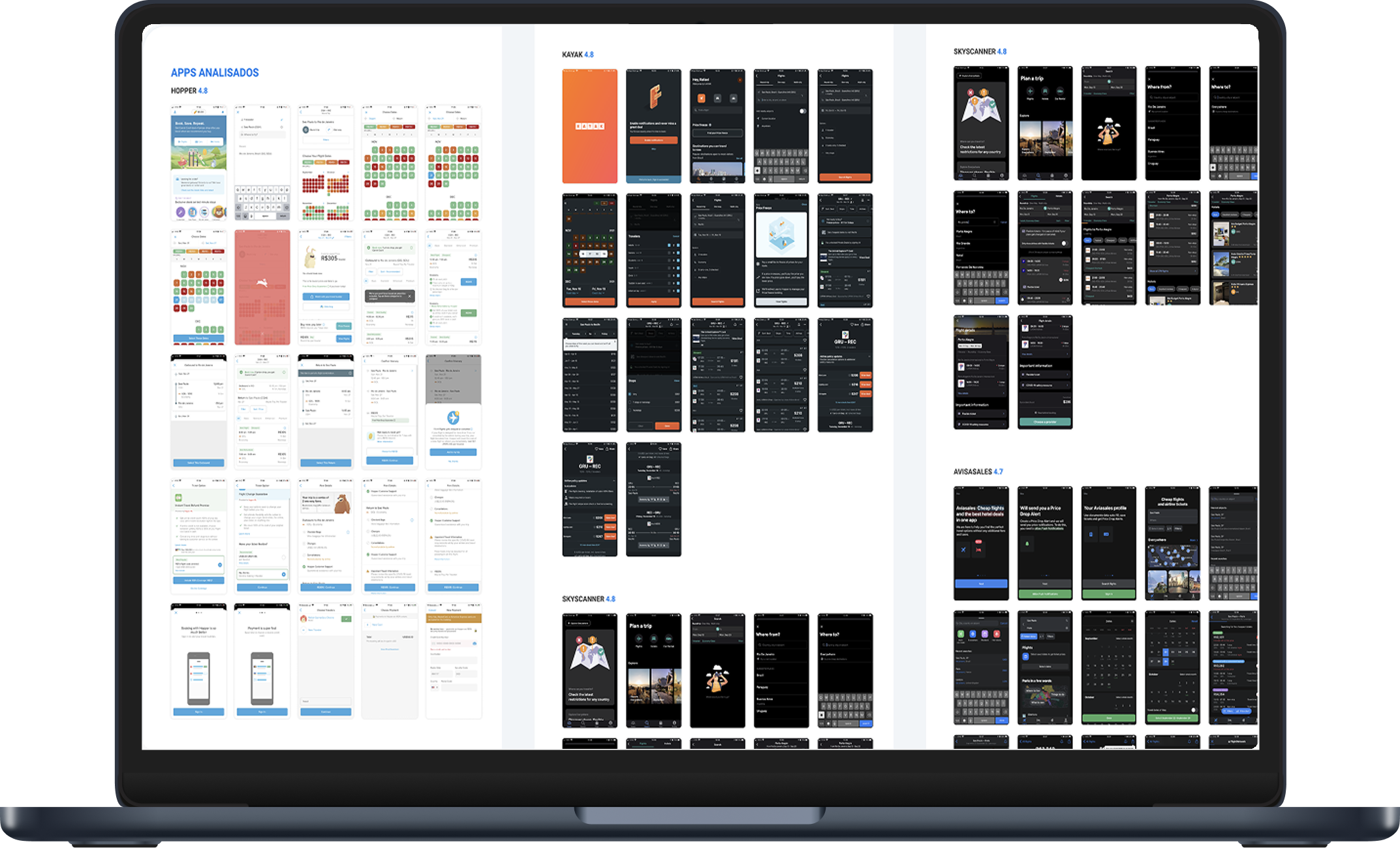
Benchmarked Hopper, Skyscanner, Kayak, AvisaSales, and Decolar. All three principles — guided flow, one flight at a time, fully native — CVC was doing the opposite on all three.
2.0★ app rating
→ Webview crashes on low-end devices
40s loading time
→ Webview rendering, no native optimization
6% checkout conversion
→ Combined outbound+return cards — too much cognitive load
No reason to install
→ Same experience as desktop website, but worse
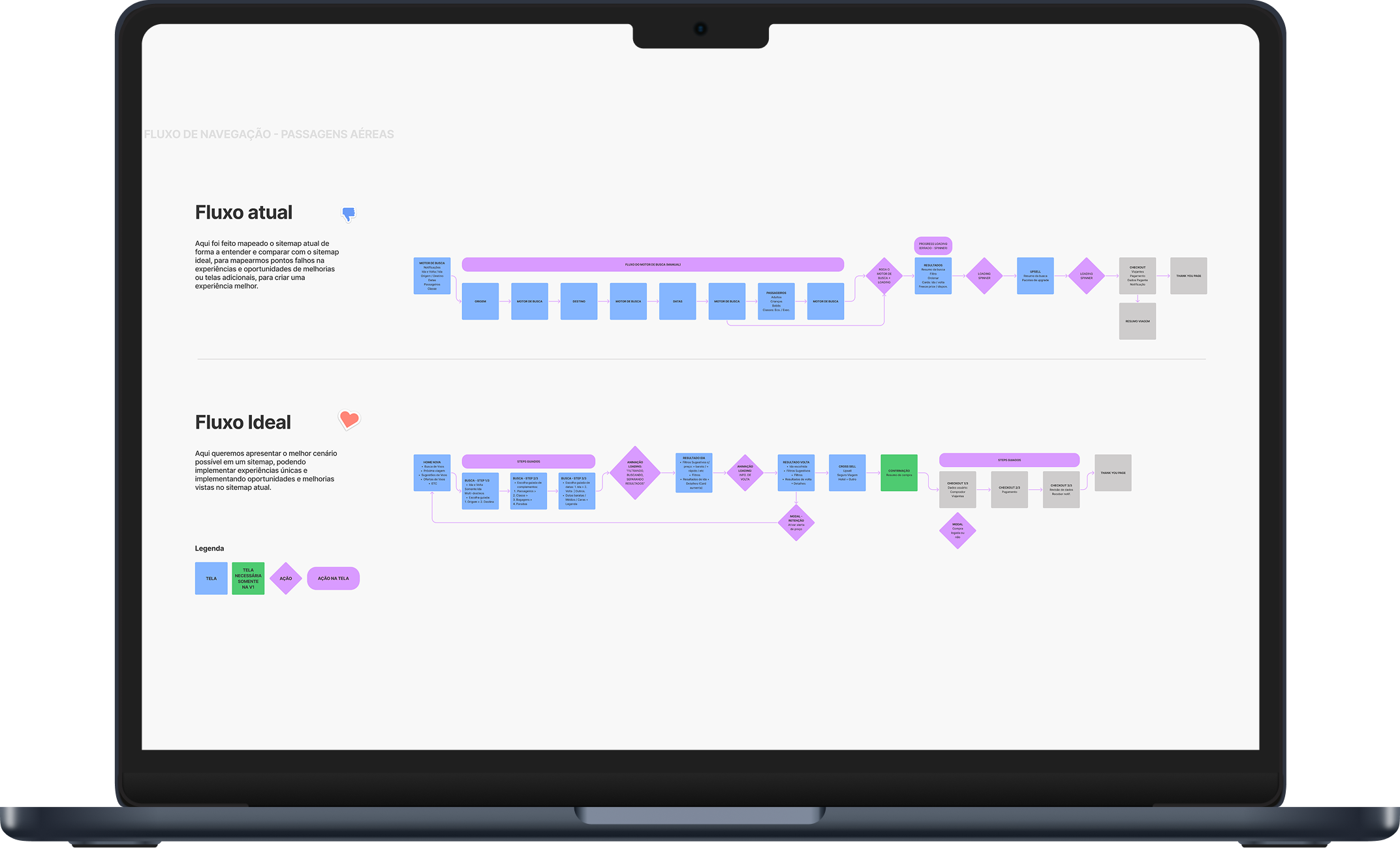
03 — The strategy
I proposed a 1-month bet
instead of a 6-month rebuild.
Go native on flights first — the most profitable product. Run a 50/50 A/B test in production for 1 month with metrics defined upfront. If it works, scale to hotels, packages, car rental. That's how I got stakeholders to say yes: smaller scope, contained risk, clear go/no-go criteria.
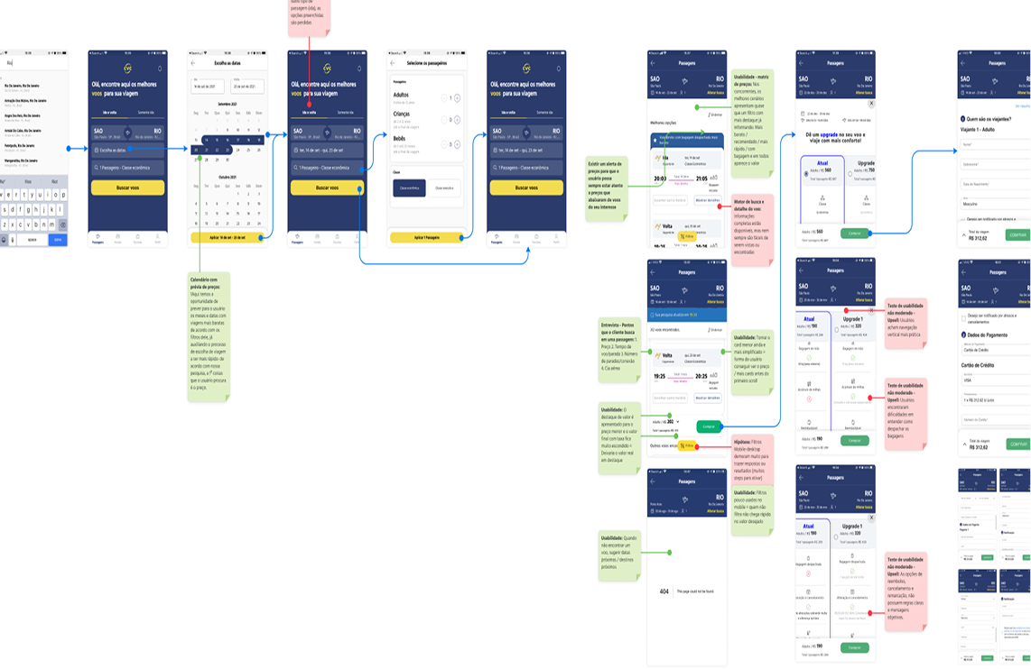
04 — The riskiest decision
Separate outbound and return.
Stakeholders were against it.
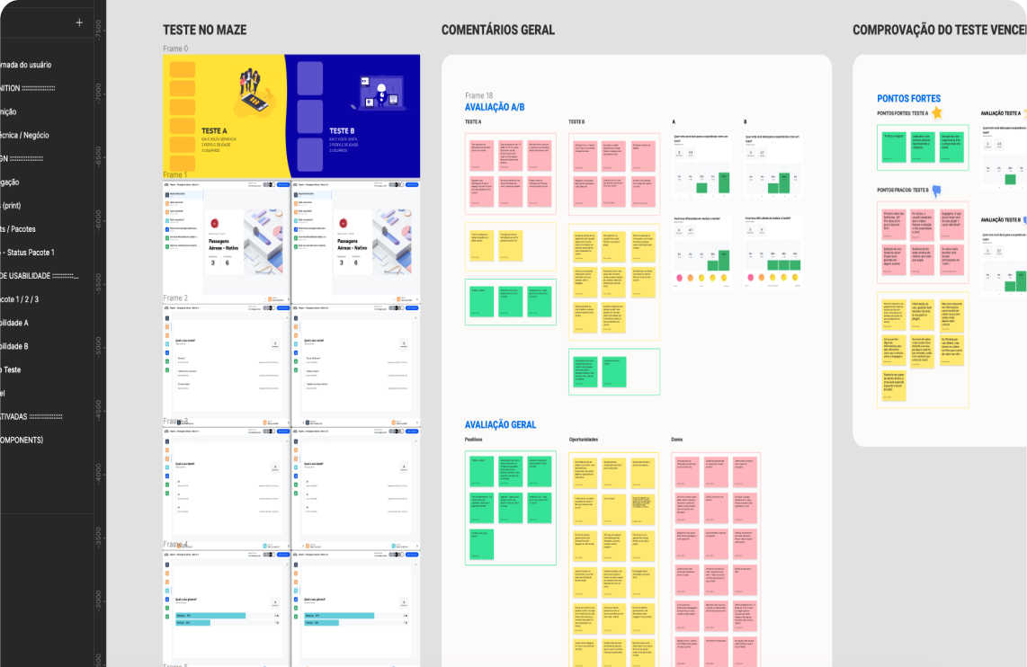
The combined outbound+return card was the default. Everyone assumed it was correct. I ran a Maze A/B test with 10 users before committing to hi-fi.
B — Combined
18.9s
Score: 40
“Too much info”
A — Separated
9.4s
Score: 97–100
“Practical, no back and forth”
101% faster. Evidence > opinion. We moved to hi-fi with confidence.
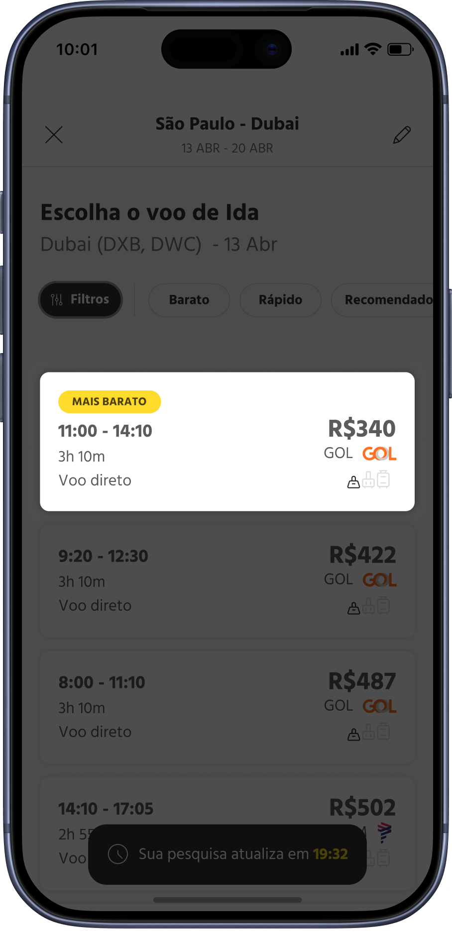
Outbound + return on one card. 18.9s to choose. “Too much info.”
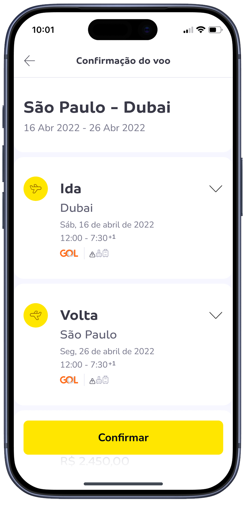
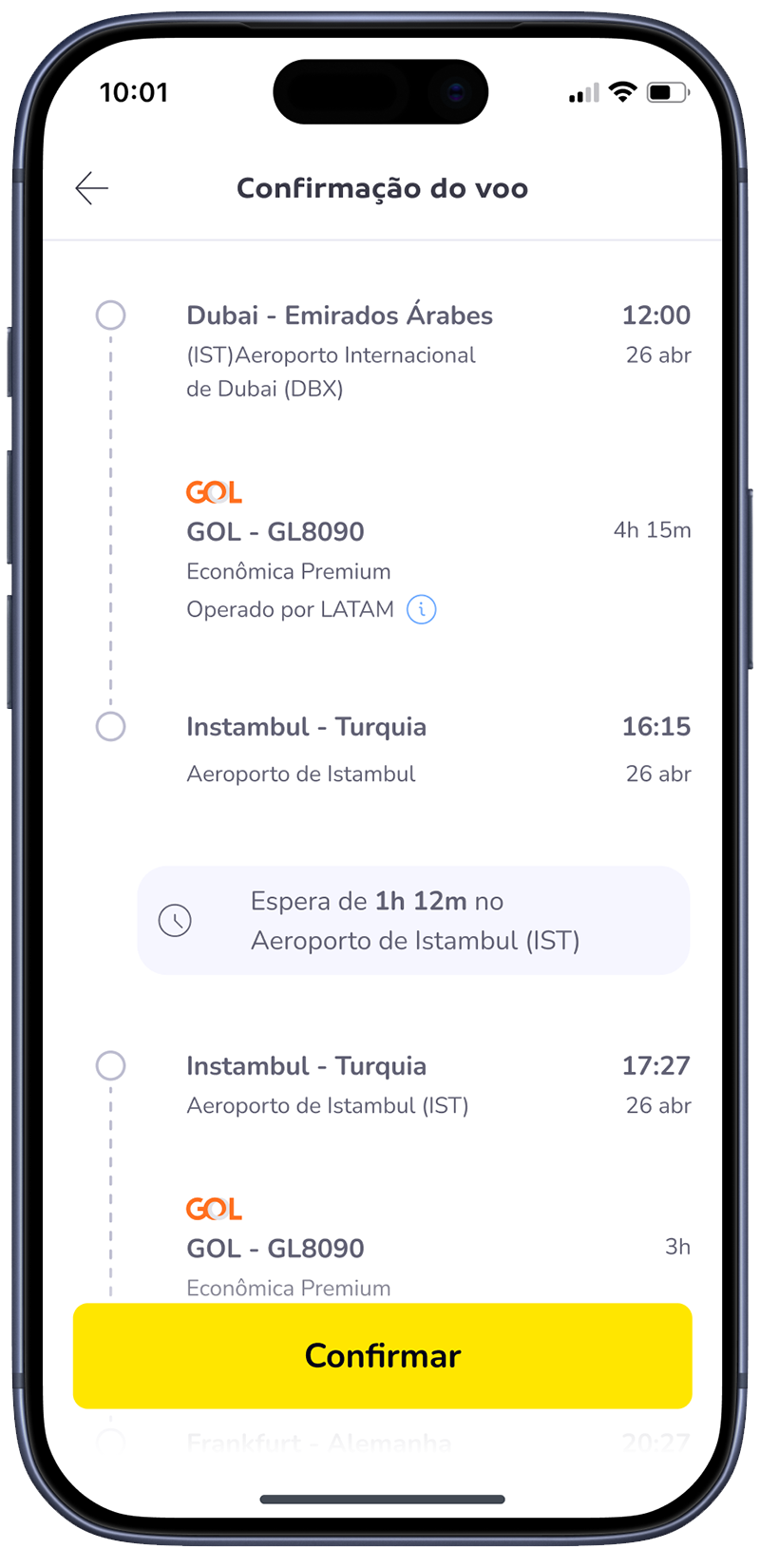
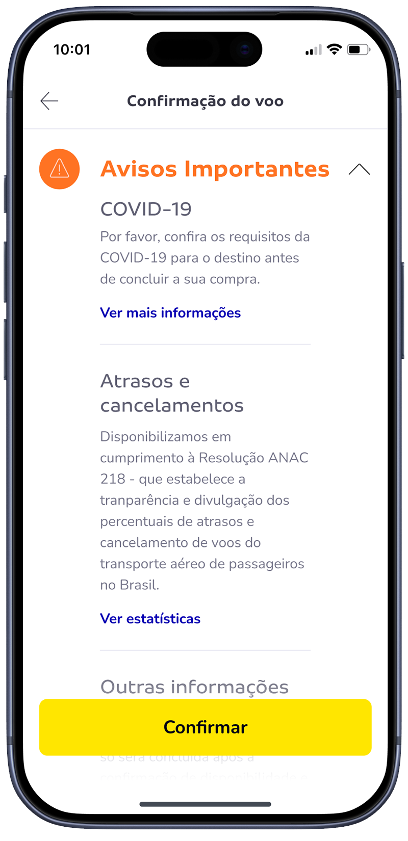
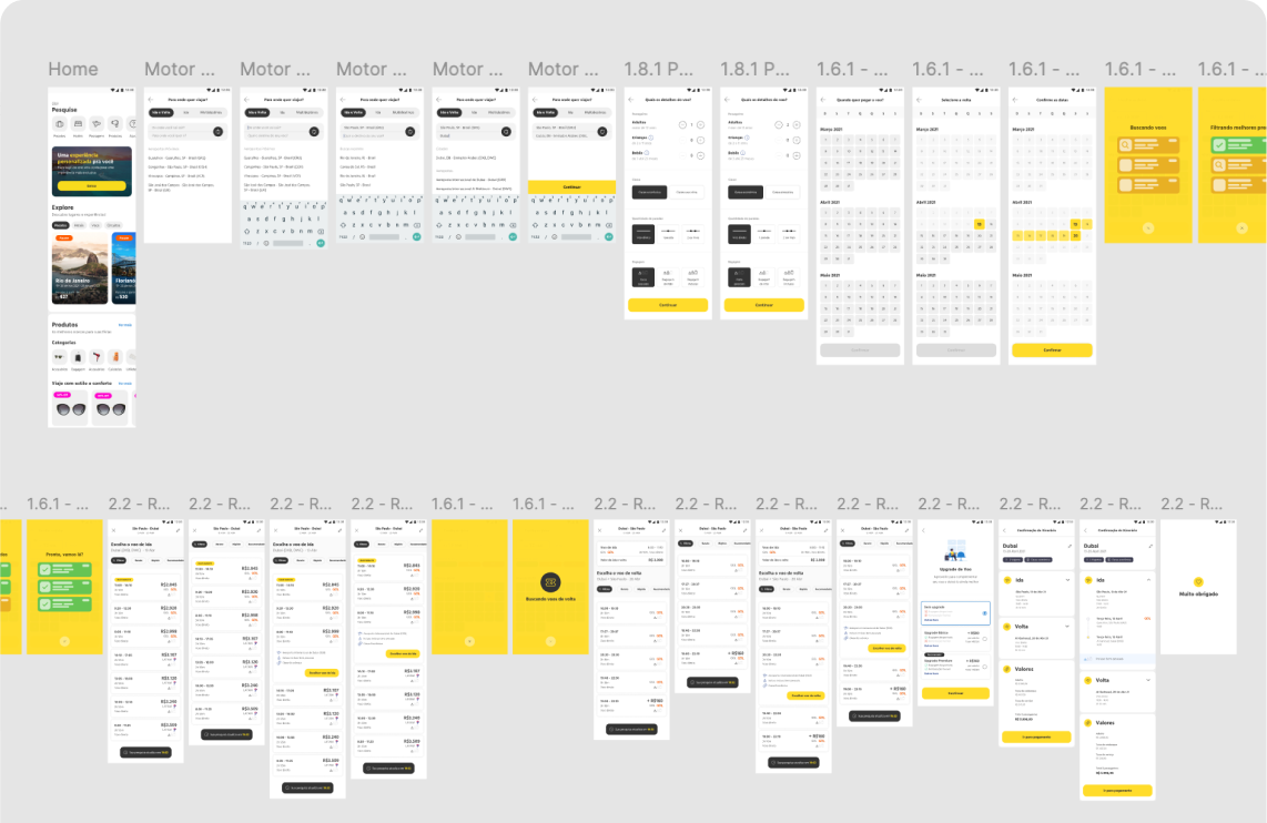
05 — The product
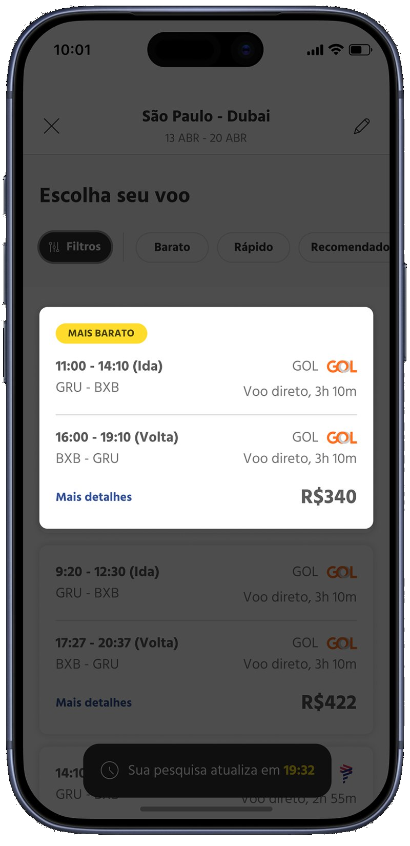
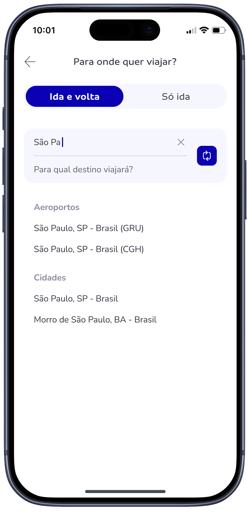
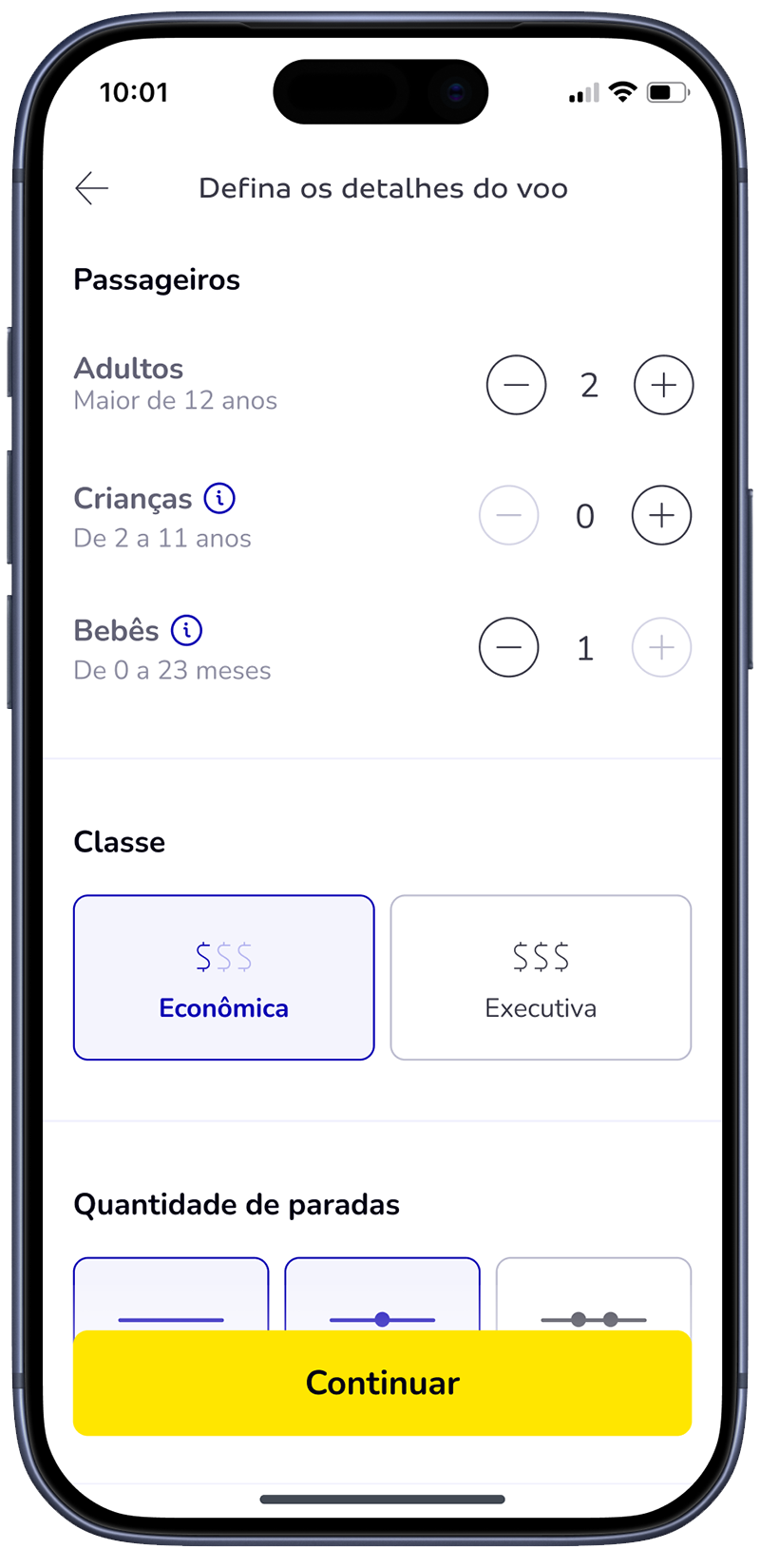
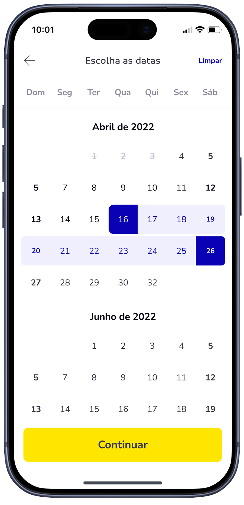
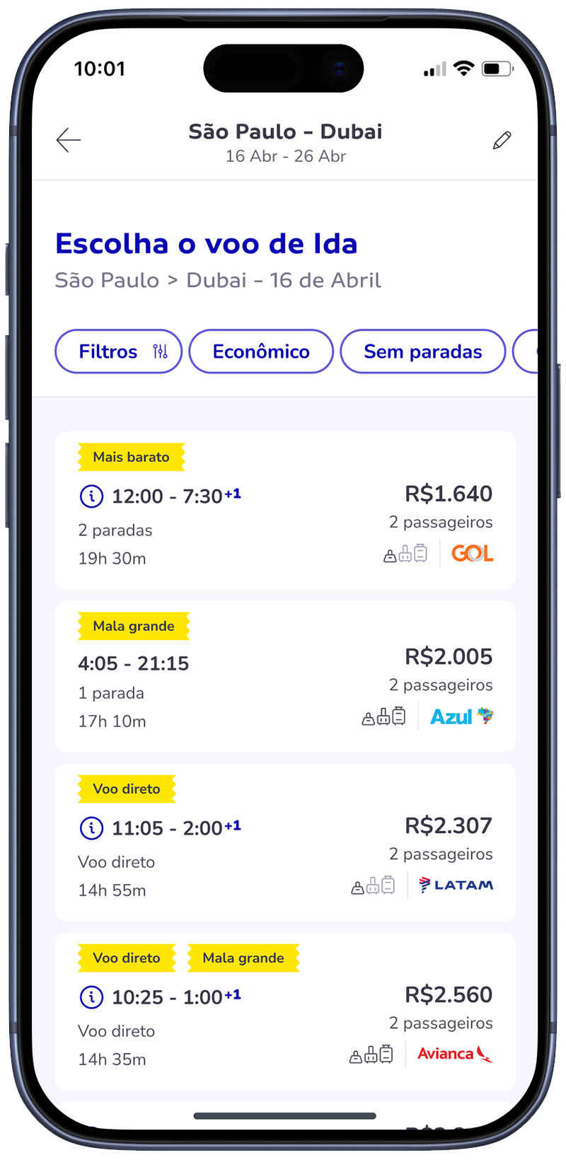
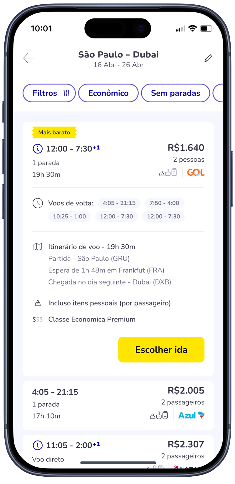
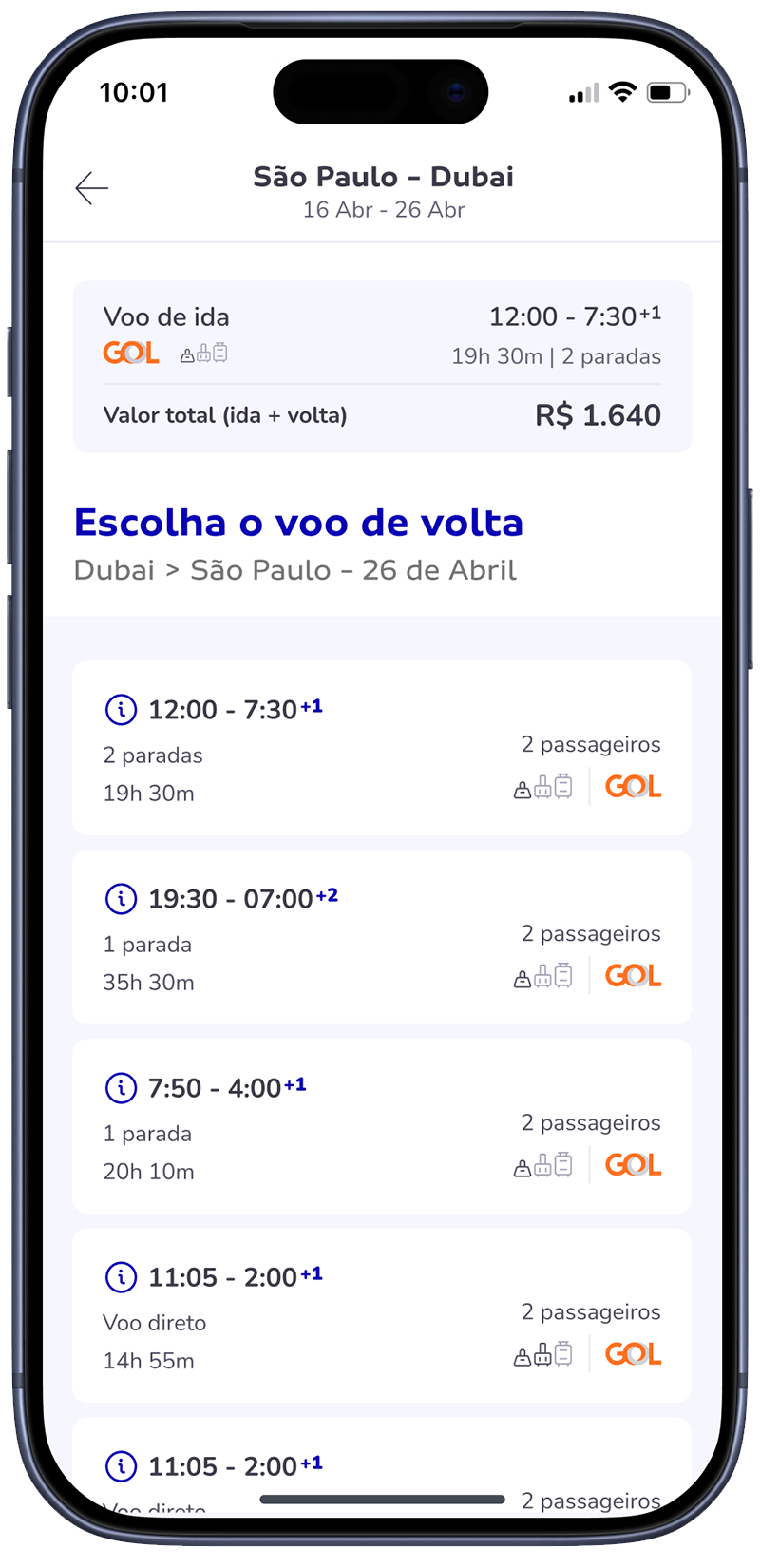
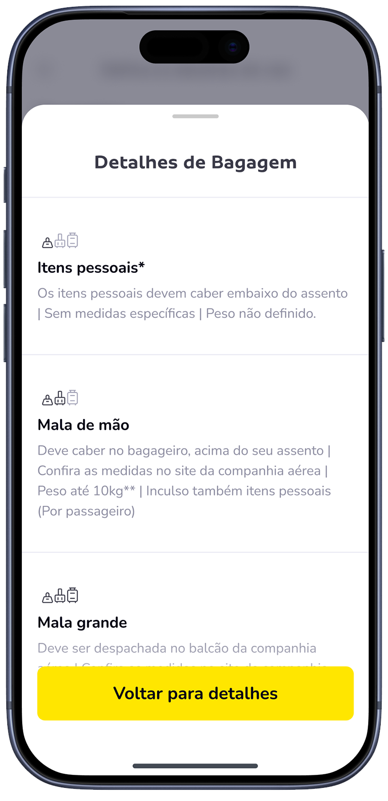
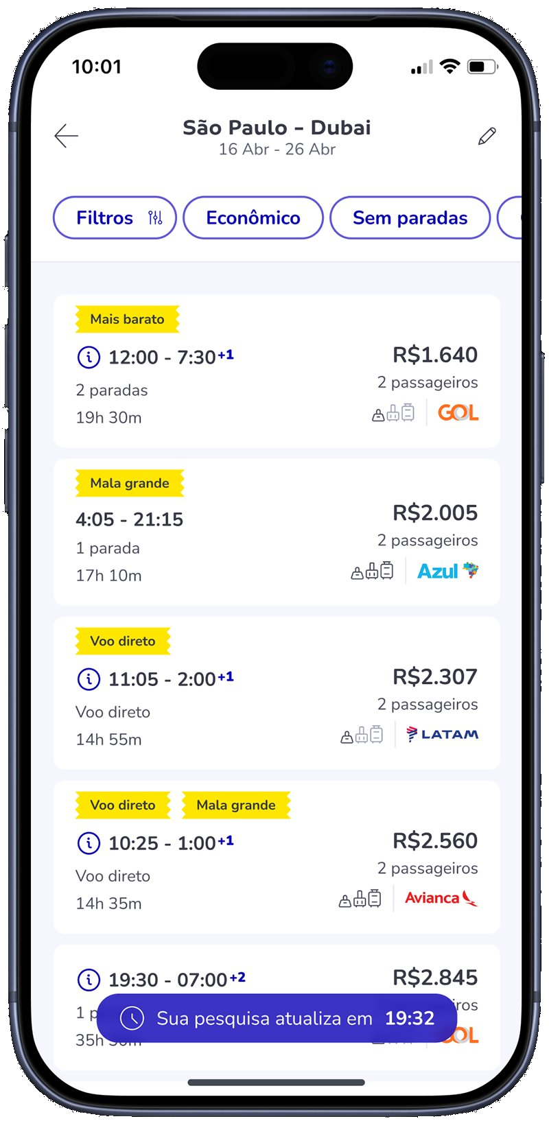
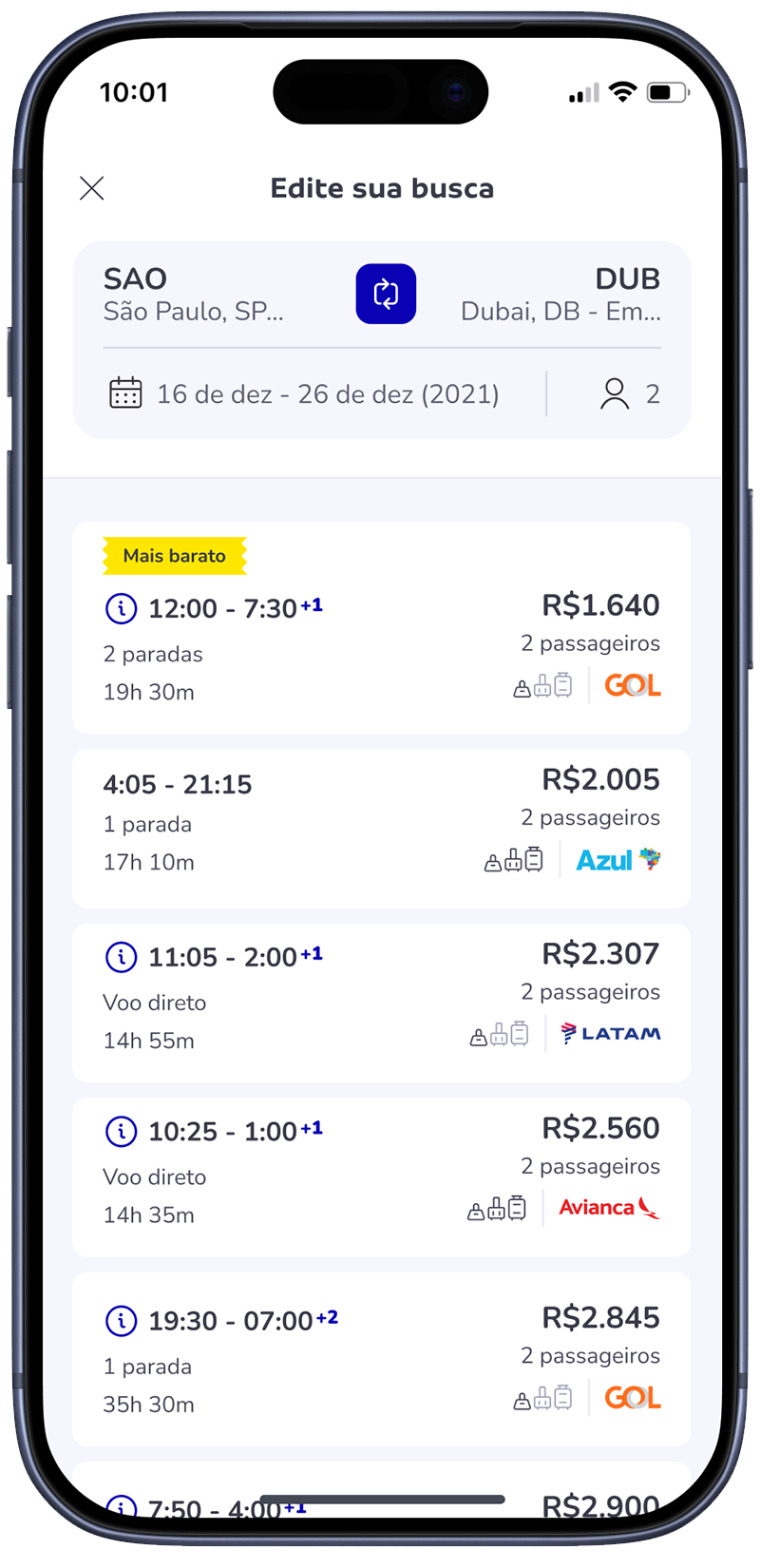
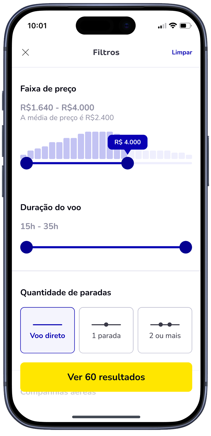
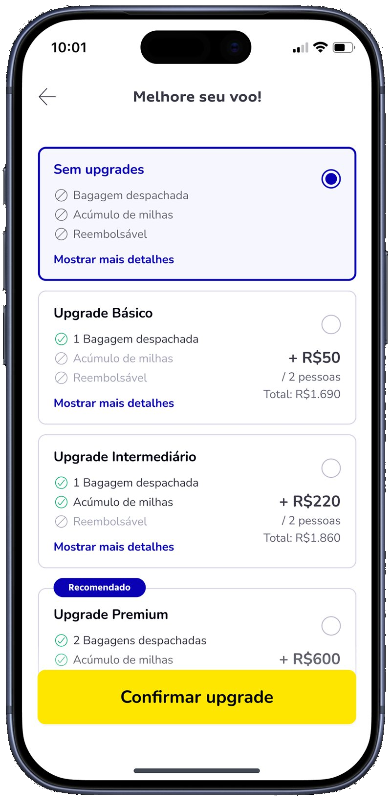
The new flow replaced a fragmented multi-step search with a linear 3-step guided experience — destination, details, dates. Results show one flight at a time, outbound then return. Flight details expand inline without leaving the list. Confirmation appears before checkout, not inside it.
Hi-fi prototype
The whole app, prototyped
and tested end to end.
I built the entire experience as a clickable hi-fi prototype — guided search, results, flight details, baggage, passengers and confirmation — not just isolated screens.
That let me run real usability tests on the full journey before a single line of code — validating the one-flight-at-a-time decision and handing engineering a flow already proven to work.
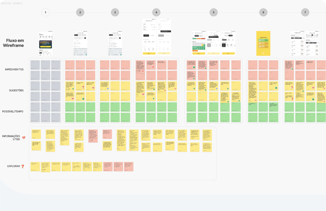
06 — More of the product
Scroll — the device stays, the screen changes.
07 — Outcomes
Tracked via Mixpanel
Checkout conversion rate — end-to-end flight booking
6.4%
Before
→
20%
After
08 — What I learned
01
Define metrics before pixels.
Setting success metrics upfront aligned PM, Engineering, and gave me clear go/no-go criteria. It's what made the A/B test decisive instead of debatable.
02
Test the riskiest decision first.
Testing the outbound/return split before investing in hi-fi gave me the evidence to challenge stakeholder assumptions confidently.
03
Sell a bet, not a vision.
1-month A/B test instead of 6-month full rebuild. Smaller scope, contained risk, metrics upfront. That's what got the yes.
04
Native DS compounds.
Investing in mobile-specific components improved usability in ways that web-ported components never would have. The experience felt like a different product.