01 — The challenge
How to simplify my
immigration process?
Canadian immigration is one of the most complex bureaucratic journeys a family can face. Multiple pathways with different requirements, CRS scores that change monthly, documents that expire, language tests with specific benchmarks per program — and laws that tighten without warning.
Consultancies charge thousands but run closed back-offices: you pay, you wait, and you never actually know where you stand. There was no self-service product that guided a family through it — showing the score, ranking the pathways, tracking every document, and telling you exactly what to do today.
Real family needs
Documents, deadlines and decisions that affect your entire life
Complex journey
9 phases, 27 steps, multiple pathways with different risks
Constantly changing laws
Immigration rules shift monthly — every week without a plan is a week lost
Zero visibility
No tool shows where you are, what's next, or who's the stronger applicant
02 — The solution
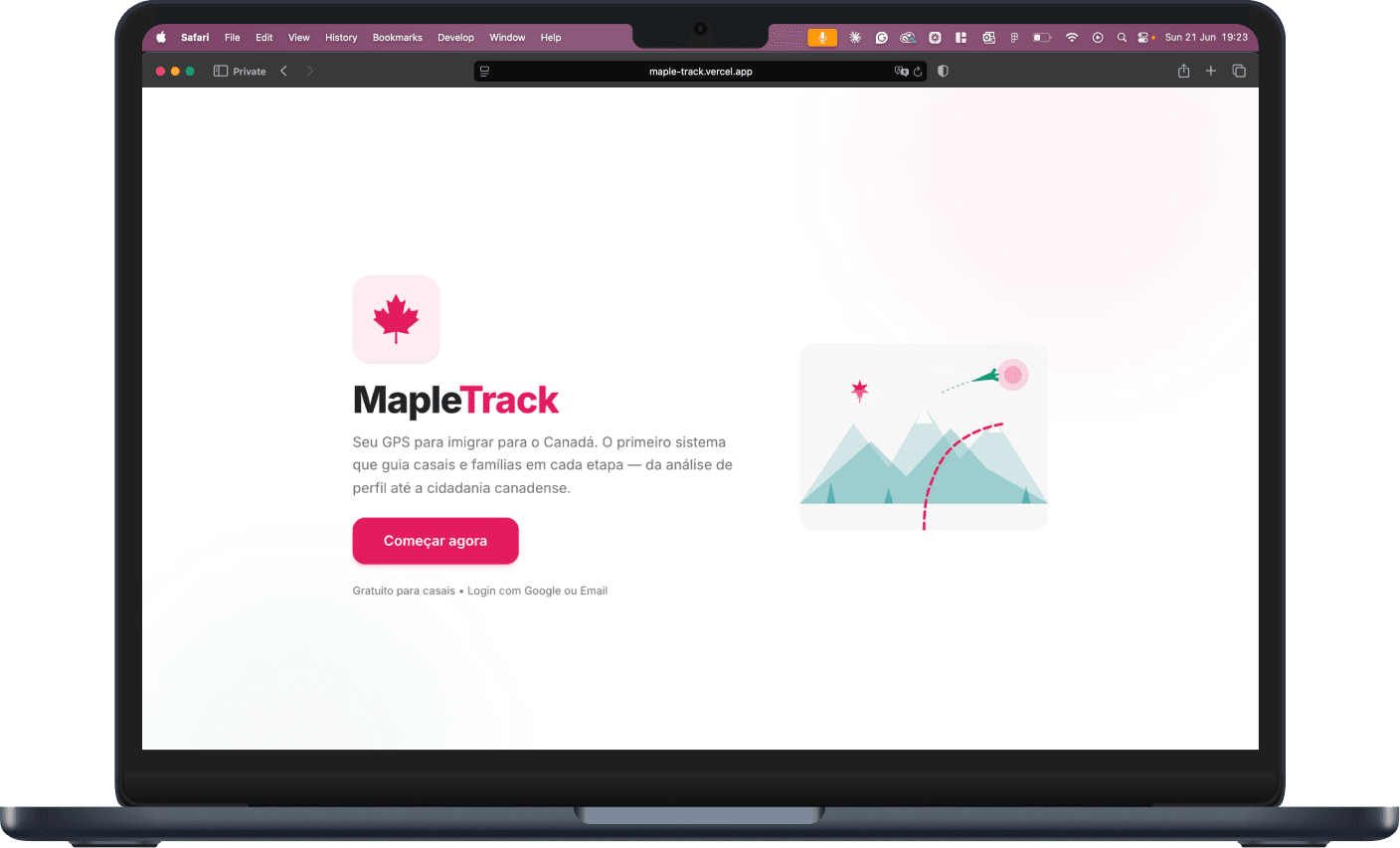
MapleTrack is a full product — not a prototype, not a dashboard. A responsive SaaS platform with 9 integrated sections covering every aspect of the immigration journey: profile analysis, CRS simulation, pathway ranking, multi-plan strategy, document management, language tracking, job search, gamification, and household management.
How it was built
6+ months of work.
Shipped in 2 weeks.
Using Claude Codeas a design partner — ideation, content strategy, UX writing, frontend and backend code. Every design decision was mine; Claude executed. The result: a complete squad's output from one designer.
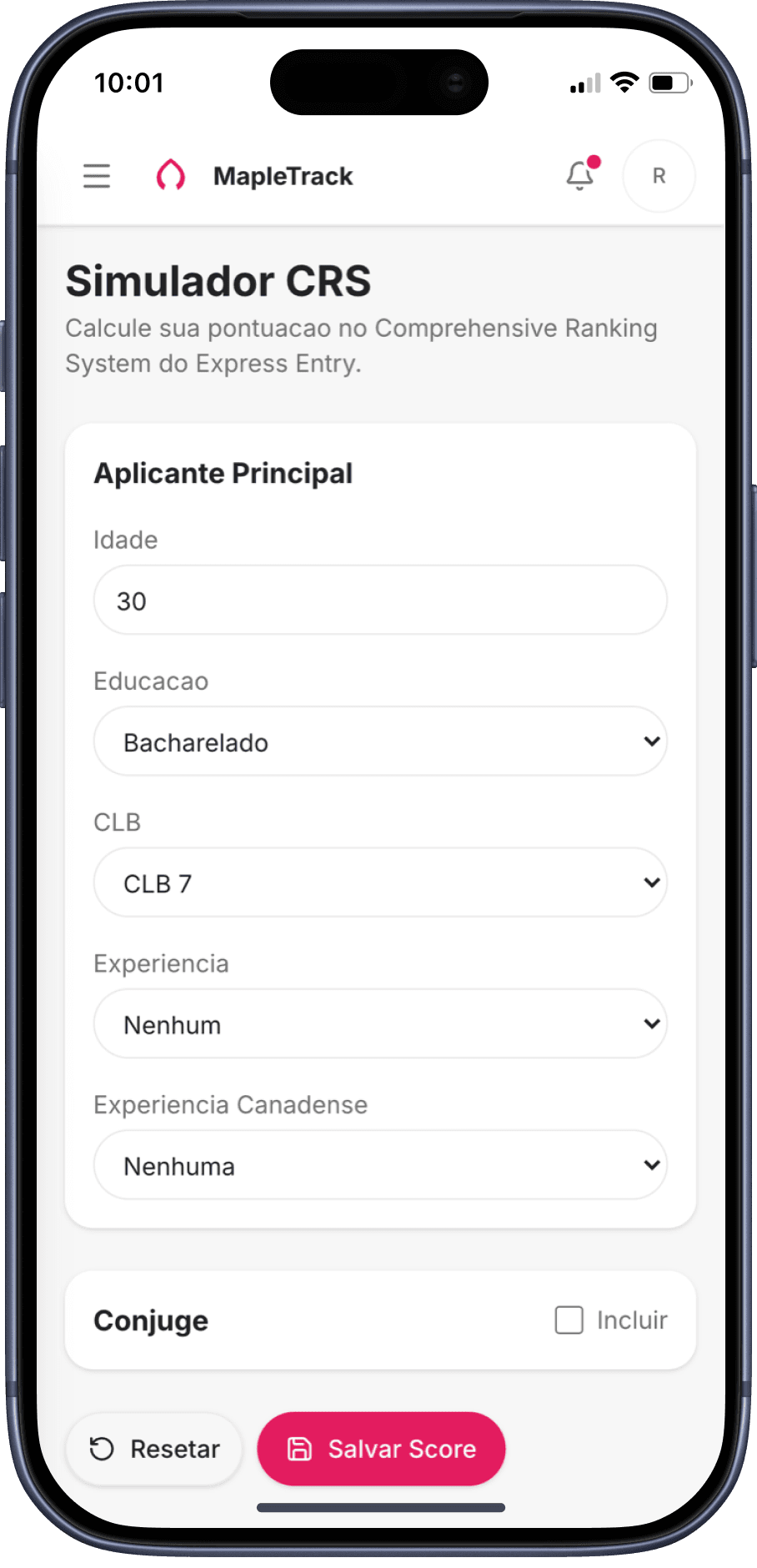
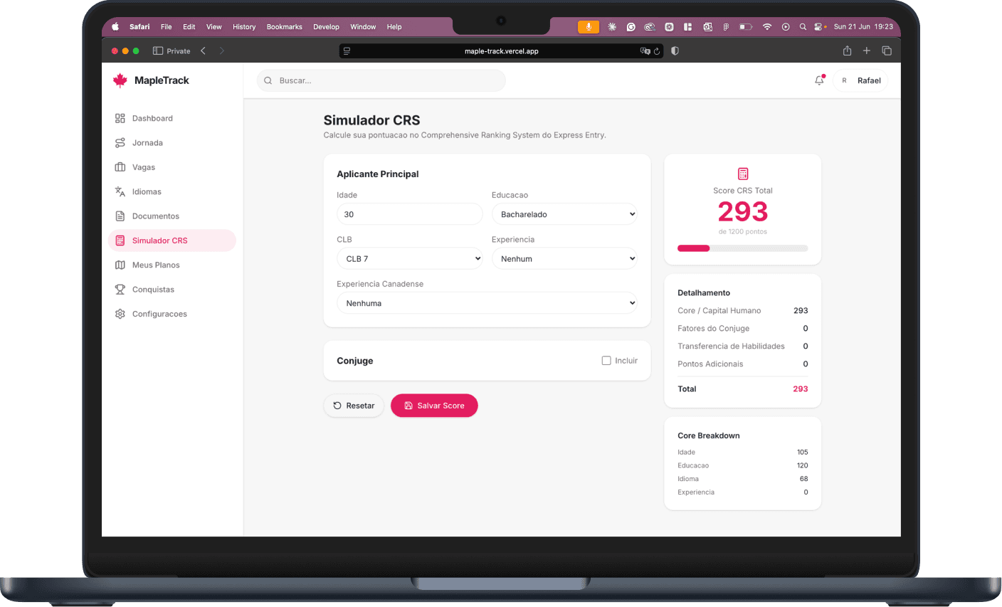
04 · Score the profile
MapleTrack scores Rafael and Luana separately across the full 1,200-point model — age, education, language, experience — then layers in spouse factors to surface the strongest principal applicant.
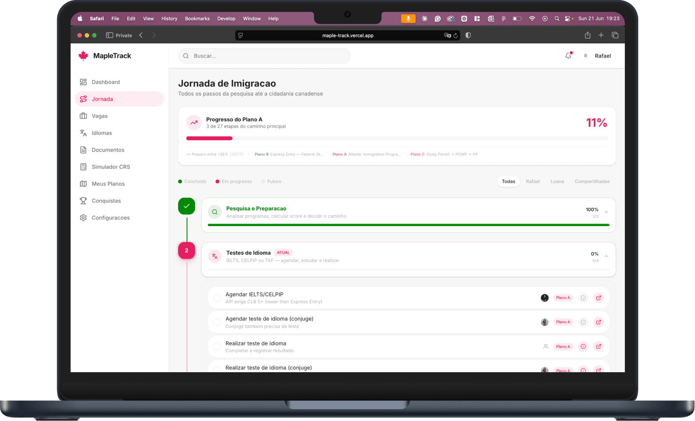
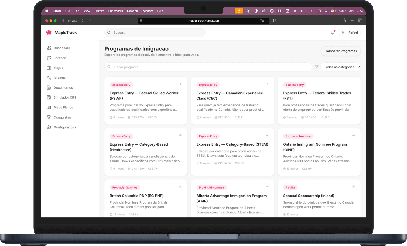
06–07 · Choose the route, hedge the bet
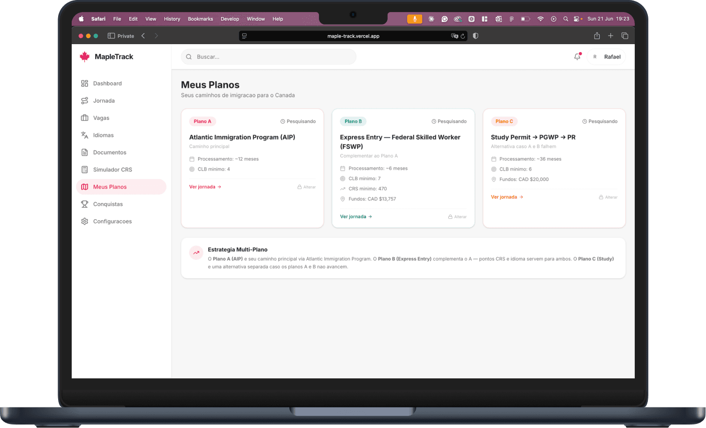
Every major Canadian immigration program ranked by fit — then organised into Plan A, B and C running in parallel, so the strategy adapts the moment a law shifts.
On desktop
On mobile
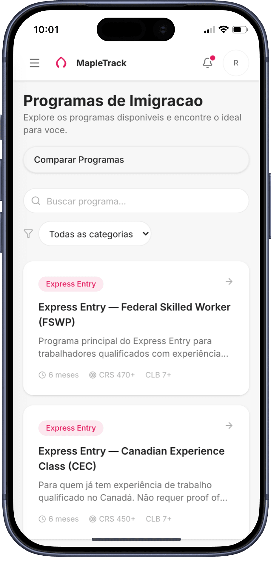
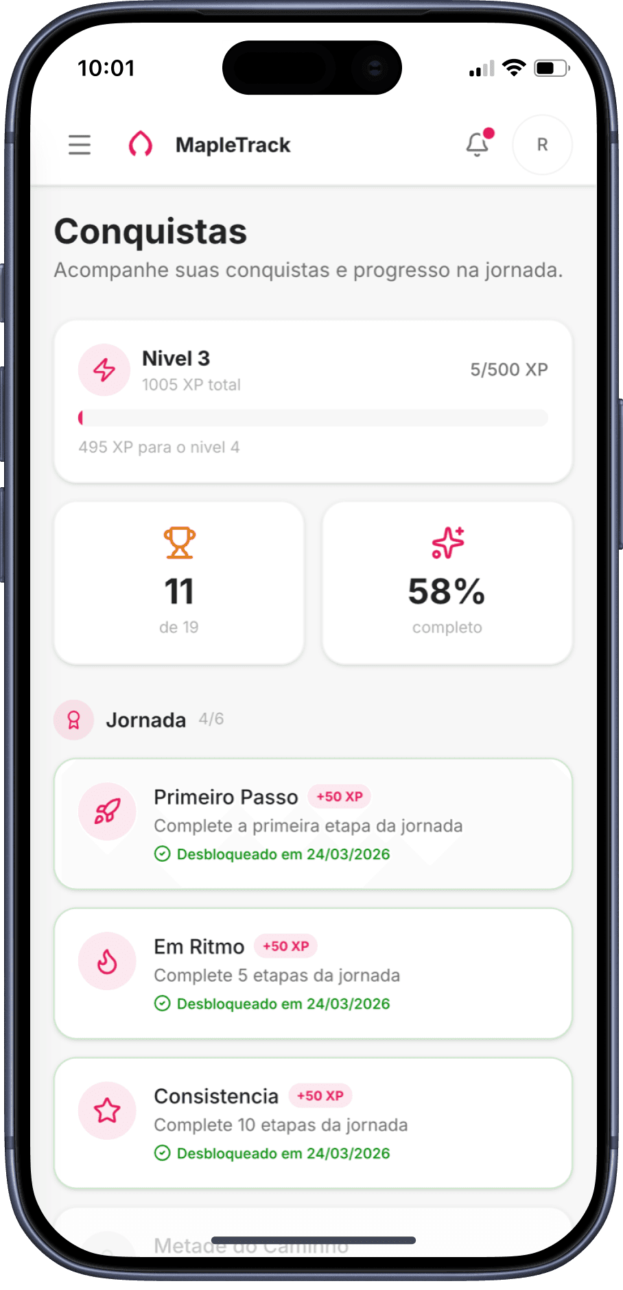
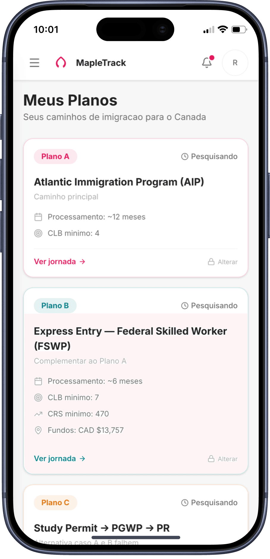
Programs → Achievements → Plans — the full decision flow on mobile
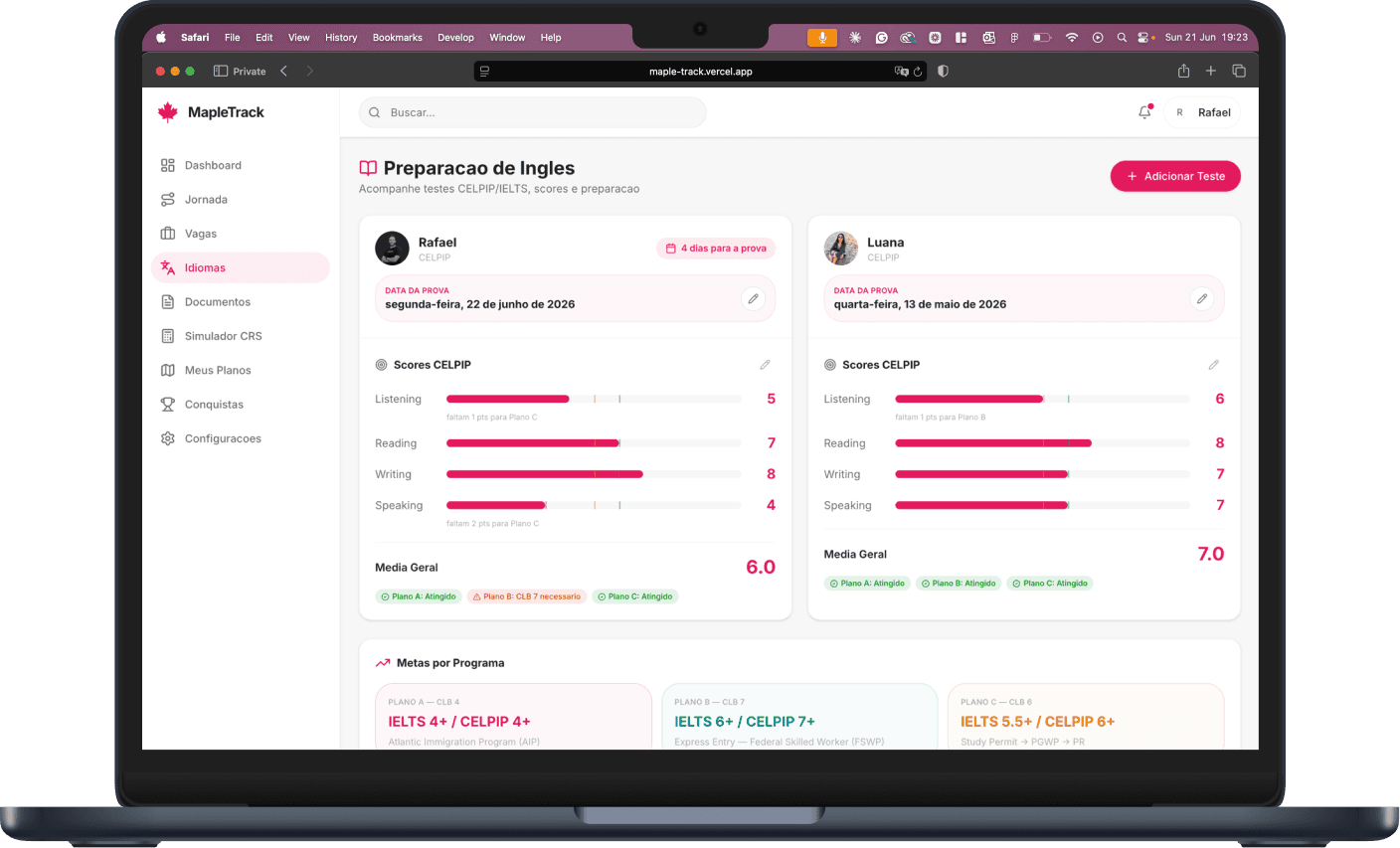
09 · Stay ready
A document hub organised by category — identity, education, language, finances, legal — tracking status, flagging what expired, keeping paperwork audit-ready for whichever plan goes live first.
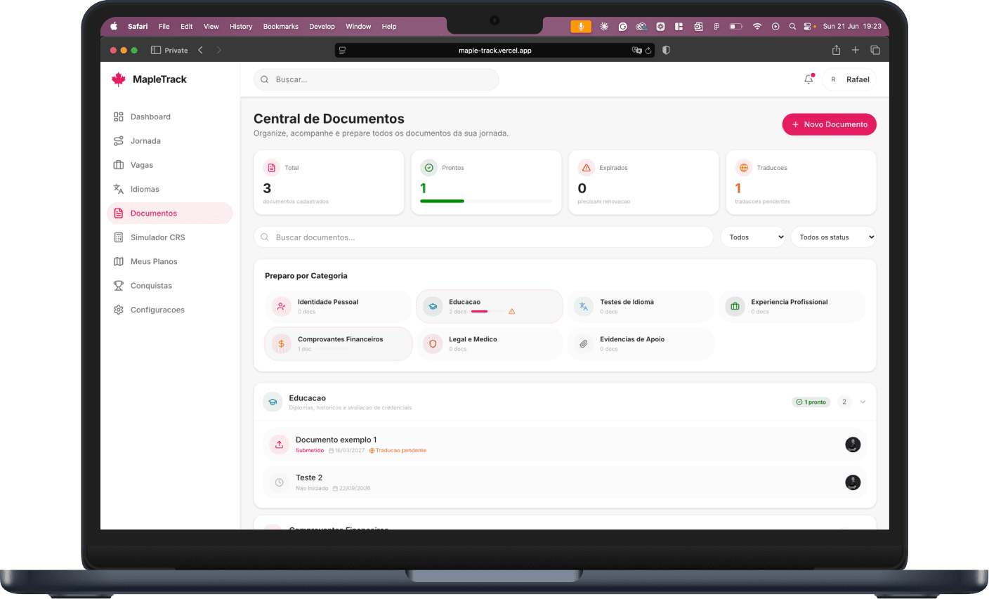
On mobile
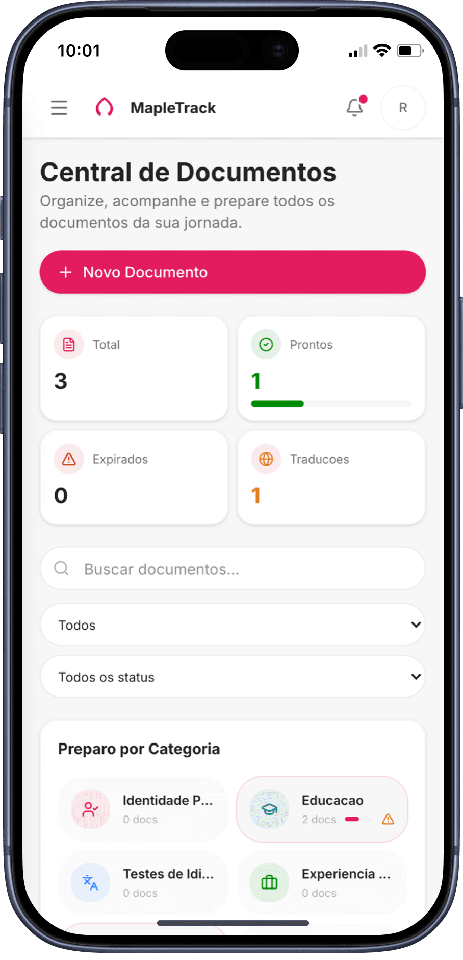
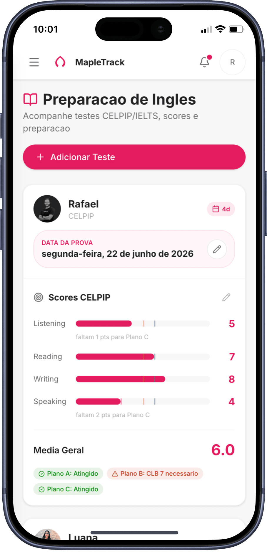
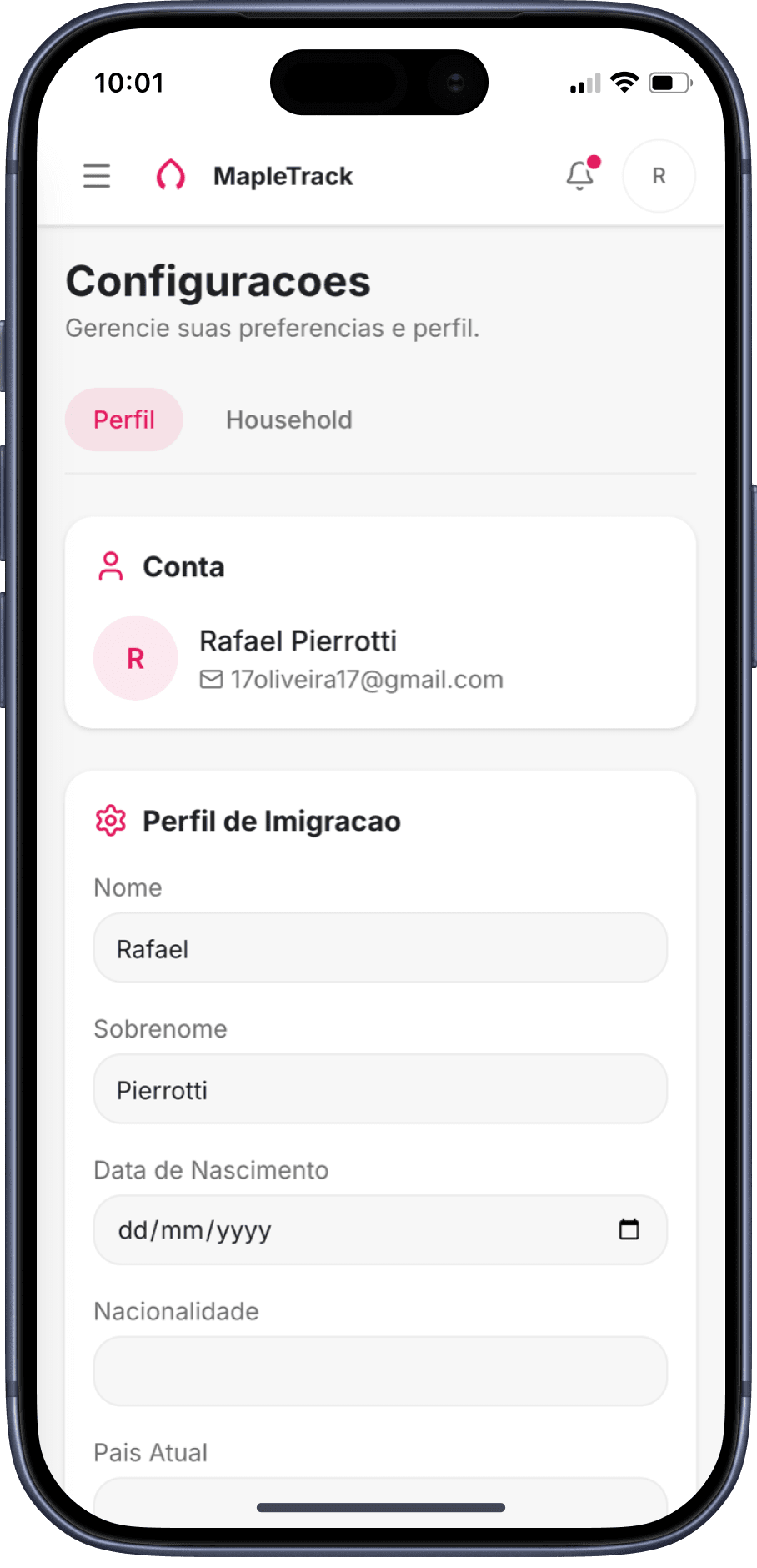
Documents → Languages → Settings — always accessible on mobile
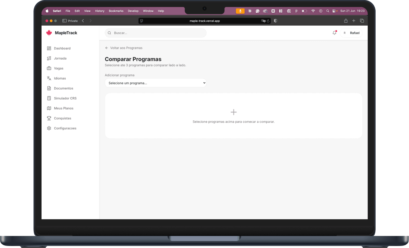
11 · Compare and decide
Every pathway compared head-to-head — processing time, language requirements, CRS thresholds, costs — so the couple can make an informed decision instead of trusting a consultant's opinion.
On desktop · switch between views
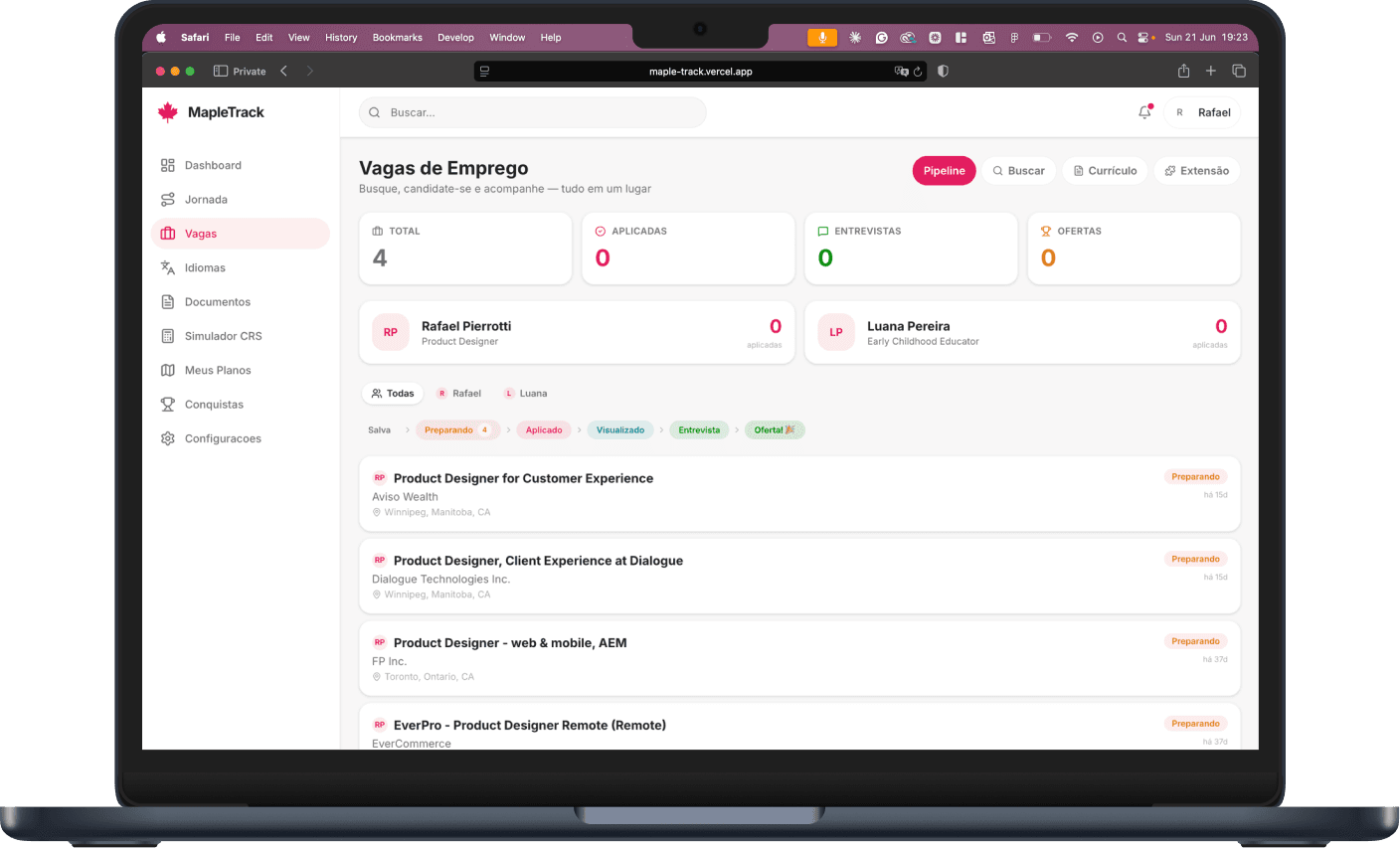
12 · One household, two applicants
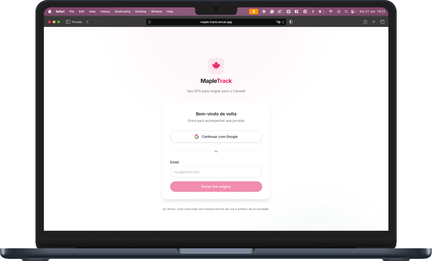
Rafael and Luana each have their own session — scores, documents and tasks tracked individually — but share one household, one set of plans, and one immigration timeline. Notifications keep both in sync.
On desktop · switch between views
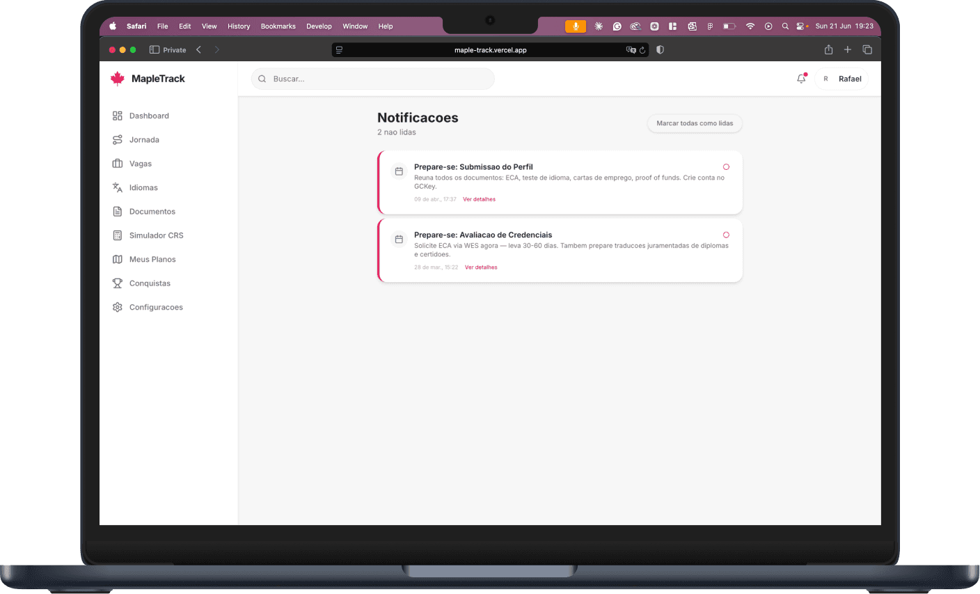
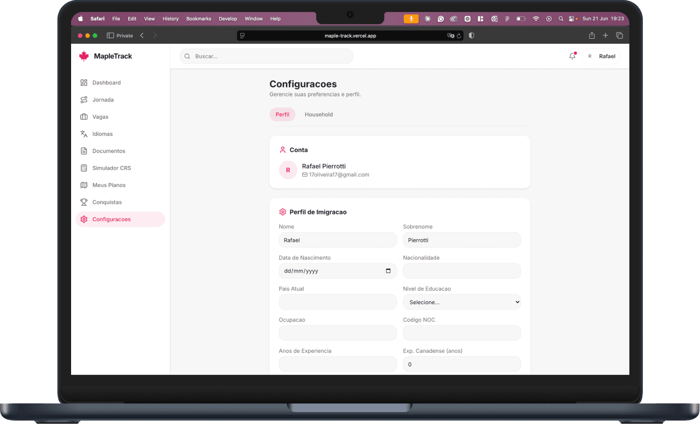
On mobile
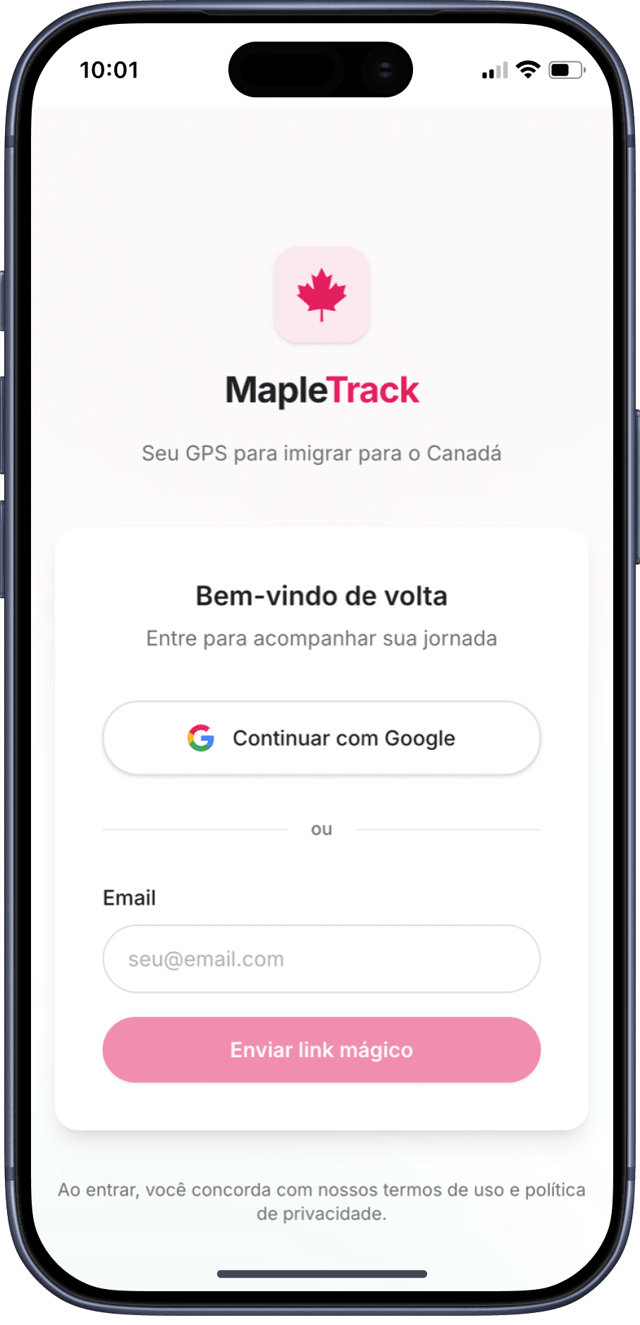
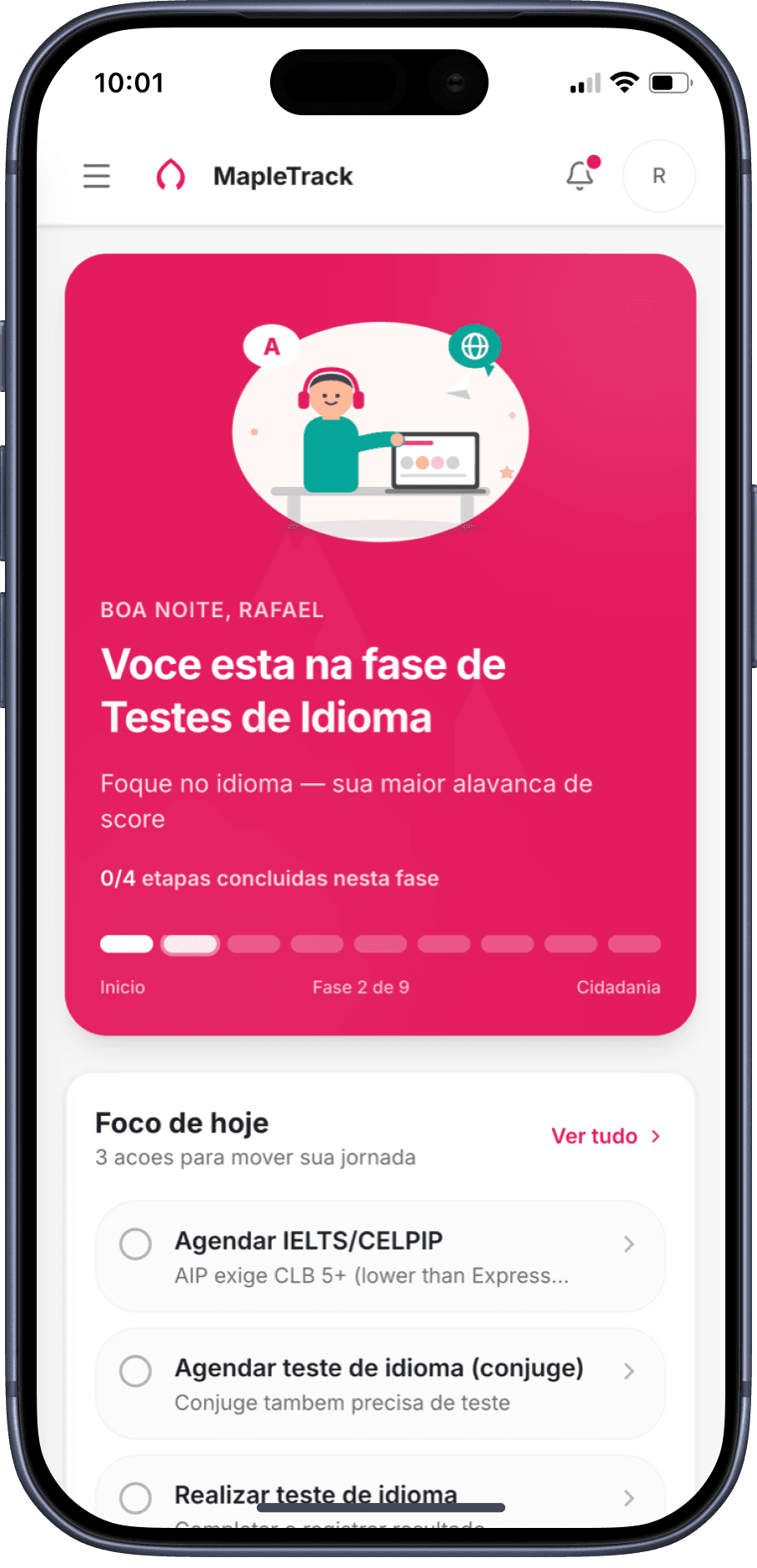
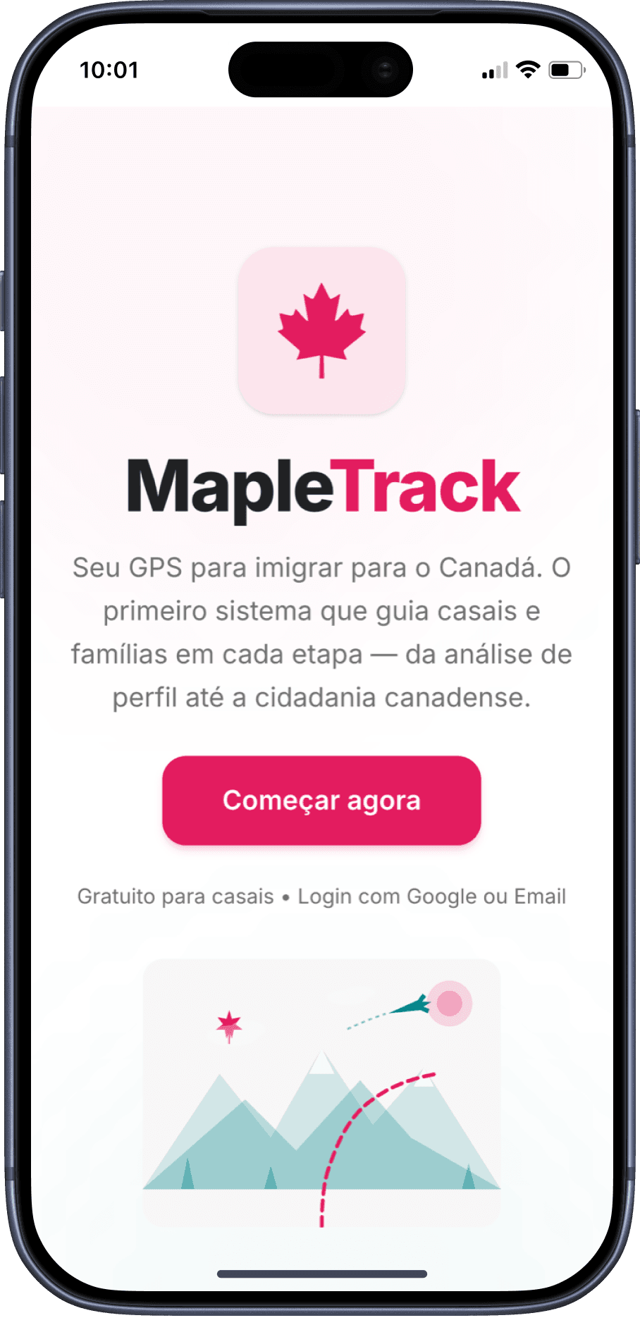
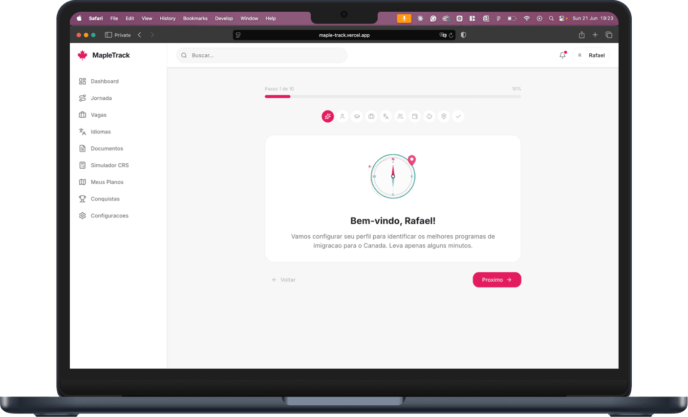
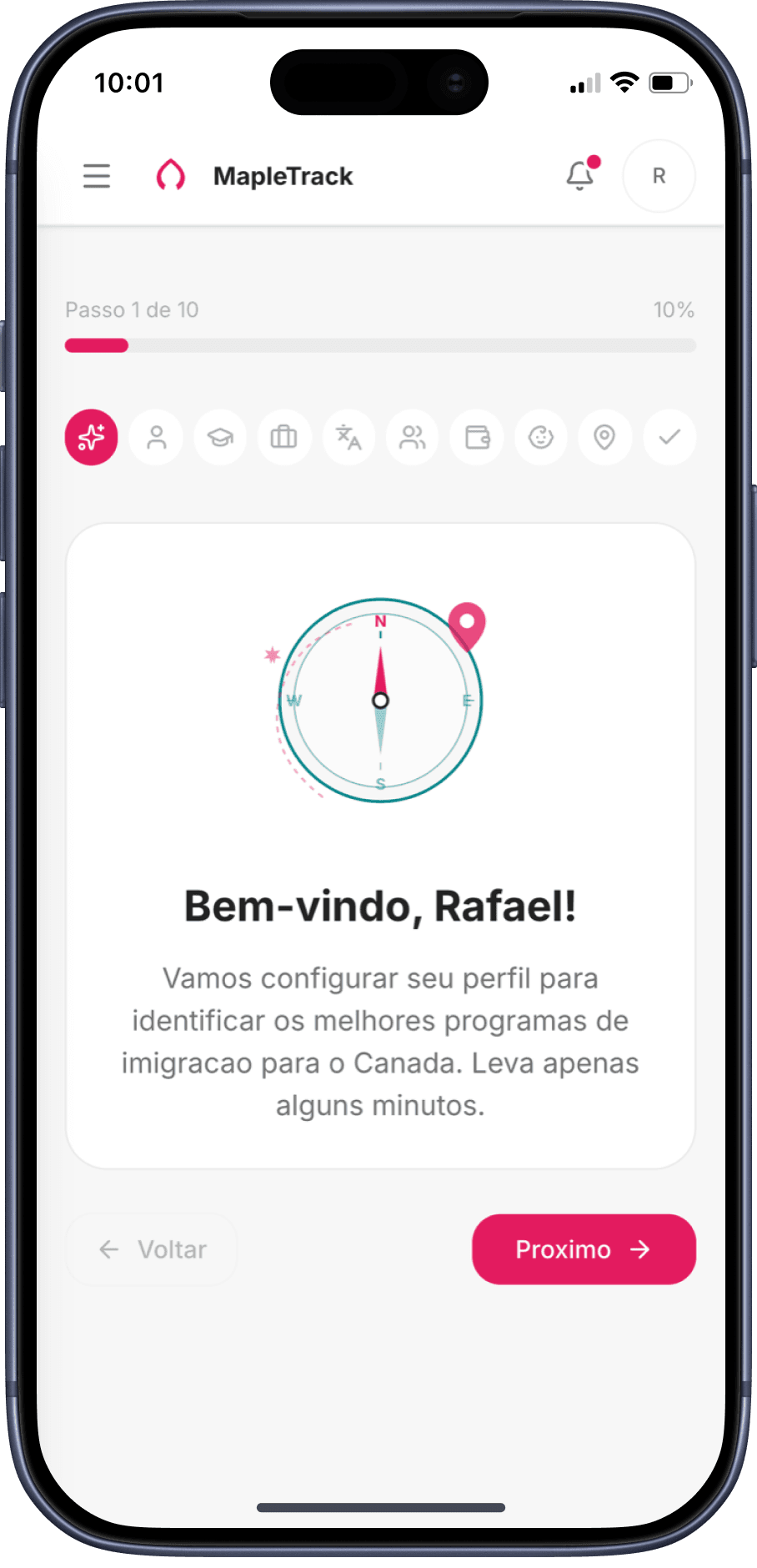
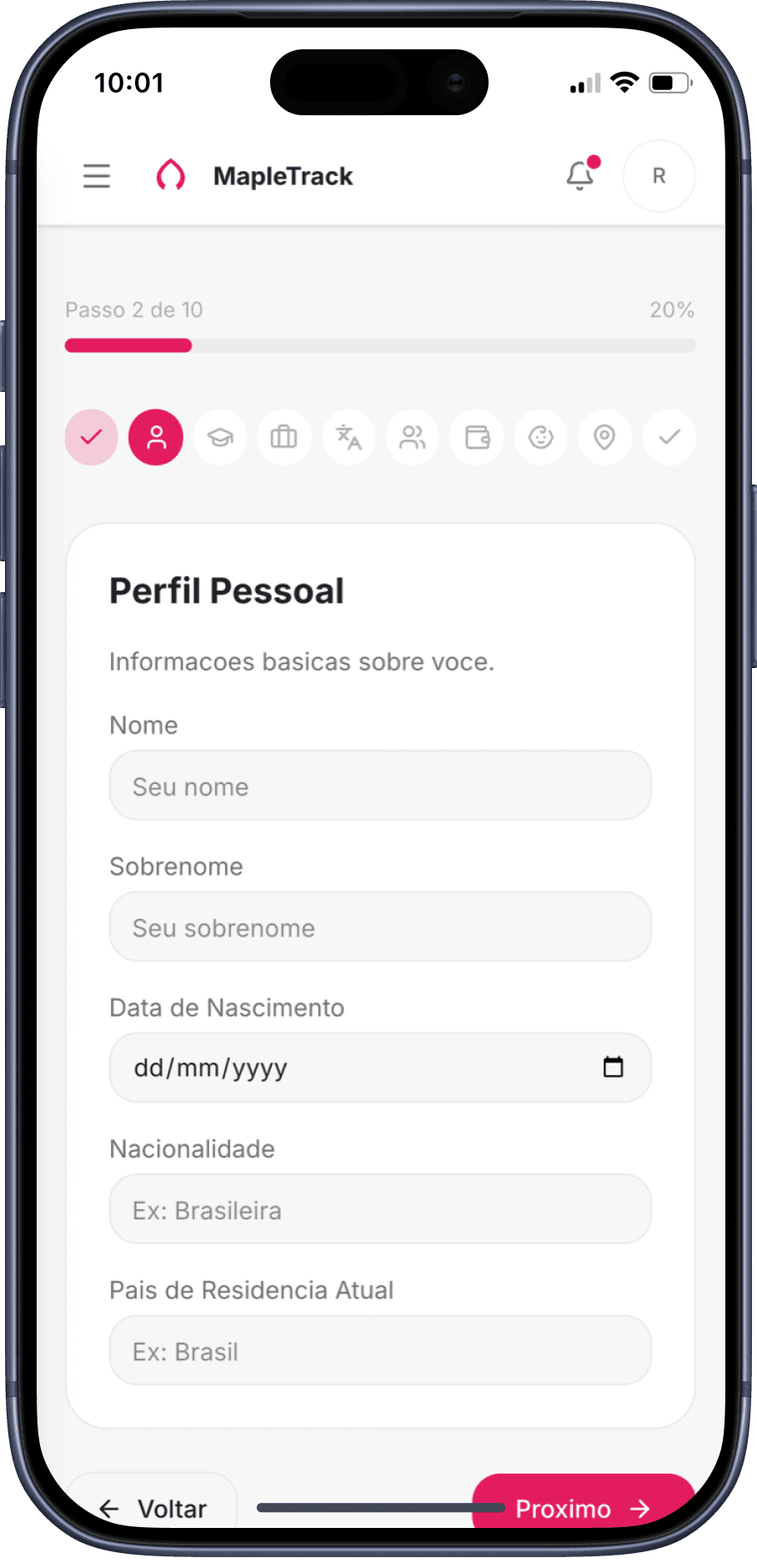
Login → Dashboard → Landing — the household experience on mobile
13 — Keep the momentum
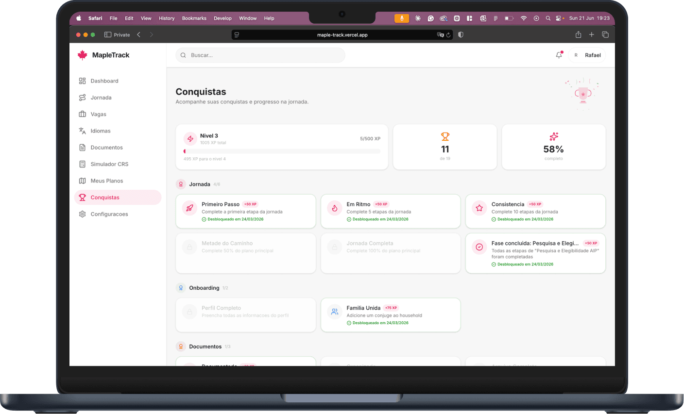
Immigration takes years, so MapleTrack is built to keep a couple moving — XP and achievements for each milestone, gentle nudges and notifications, and a household where Rafael and Luana share one journey under separate logins.
The full mobile experience
Every feature, on every device.
8 sections — every feature works on any device
14 — The craft
The whole product runs on a single token set — the MapleTrack rose, Airbnb-grade spacing and type — with shadcn/ui primitives, keyboard and contrast accessibility, and layouts that hold from a 390px phone to a widescreen desktop. The same product, everywhere.
15 — Where it stands
Live MVP · in daily use by the household
16 — What I learned
Designing for yourself is the ultimate brief.
Being user zero meant every gap in the experience was a gap in my own life. The feedback loop was instant and ruthless — the best research I've ever had.
A designer can ship production code now.
Pair-programming with Claude Code, I took this from Figma thinking to a deployed, database-backed product — solo. The design-to-build handoff simply disappeared.
A design system pays off even at n=1.
One token set and a small component library made ten feature areas feel like one product — and let me move at two-week speed without the UI drifting.
Guidance beats information.
Consultancies hand you data and a bill. The unlock wasn't more information — it was always showing the single next step. Direction is the product.