01 — Context
30% of merchants
never made it past
the menu step.
Rappi operates across 9 countries, 250 cities, 100M app downloads. The merchant onboarding was the front door for every restaurant partner — and it was broken. 30% dropped at the menu step, 20% at documents, and the full process took 2 weeks from sign-up to first order.
I was the solo designer, working with 8 engineers, 1 PM, and 1 Tech Lead across Colombia, Mexico, and Brazil. The roadmap already existed — and it was wrong.
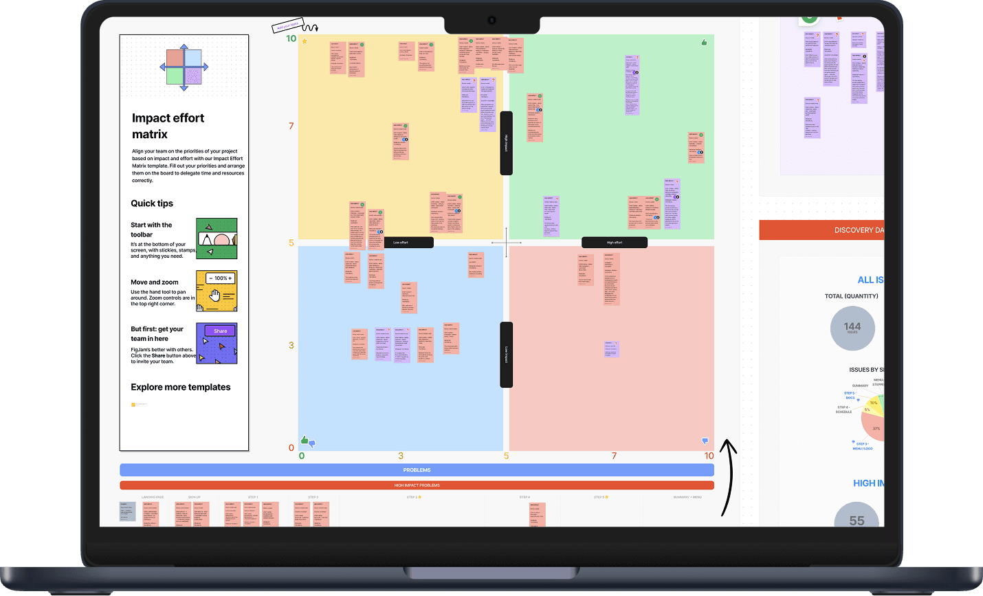
02 — The diagnosis
I mapped every friction point in production and ranked them by severity. 144 problems total — categorized by impact across 30%/33%/37% severity tiers. The original plan was a full 6-month redesign delivering zero value until month 3. I proposed the opposite: fix the highest-impact bugs first and ship value from week 1.
03 — How I changed the plan
I showed the cost
of waiting 6 months.
With a 30% drop-off at the menu step, every month of waiting was merchants lost permanently. I quantified the cost and proposed splitting into 3 releases — fix first, redesign after — delivering value from week 1 instead of month 3.
That's how I got buy-in. Not with a vision deck. With a cost of inaction calculation.
Release 1
Fix highest-impact bugs
Menu & Documents · Week 1 value
Release 2
Discovery + partial redesign
E2E experience · Research-first
Release 3
Full redesign
New architecture · Dashboard flow
04 — Release 1: Fix first
Broken stepper, duplicate buttons,
no patterns, no guidance.
Release 1 targeted the highest-impact, lowest-effort problems. Fixed the broken stepper, removed duplicate actions, reduced cognitive load, and added guidance where there was none. Then ran a usability test with 6 users to validate and discover what to redesign next.
Usability test — prototype walkthrough
05 — Research across 3 markets
CO ≠ MX ≠ BR.
Testing all three prevented rework.
Interviewed 10 merchants across Colombia (5), Mexico (3), and Brazil (2). The usability test revealed the architecture itself needed redesigning — not just the bugs. Key insight: restaurants with human support performed better, validating the dashboard concept.
Benchmarked 6 onboarding flows: Airbnb, iFood, UberEats, DidiFood, PedidosYa, DoorDash. Best flows use free task ordering — not forced sequences. This validated the dashboard direction.
Colombia
Large restaurants with human support performed best
Mexico
Mobile-first was critical — stakeholders assumed desktop
Brazil
Menu management was the #1 time sink
06 — The redesign
4 domains → 1.
Linear and forced → free dashboard.
The old flow forced merchants through 4 separate platforms with broken transitions between them. The redesign unified everything into one domain, replaced the forced linear sequence with a free-order dashboard, and introduced qualified lead capture from sign-up — meaning we knew who was serious from day one.
Before
DOMAIN 1 · Landing
DOMAIN 2 · Lead capture + Account
DOMAIN 3 · Legal, Plan, Docs, Menu
DOMAIN 4 · Platform onboarding
Broken transitions between each domain
After
Sign up · Qualified lead · 5 min
Dashboard · merchants choose any order
Bank · Hours · Logo · Docs · Menu
Platform onboarding · Store live
1 unified domain · no transitions
07 — One of my favorite decisions
4 broken pages →
1 seamless animation.
Account creation, login, and the transition to the dashboard used to span 4 separate pages with hard redirects. Merchants would lose their state, get confused, and abandon. I collapsed all of it into a single animated transition — sign-up flows directly into the dashboard with no interruption.
Result: −60% support tickets about "navigation not working."
Login flow animation
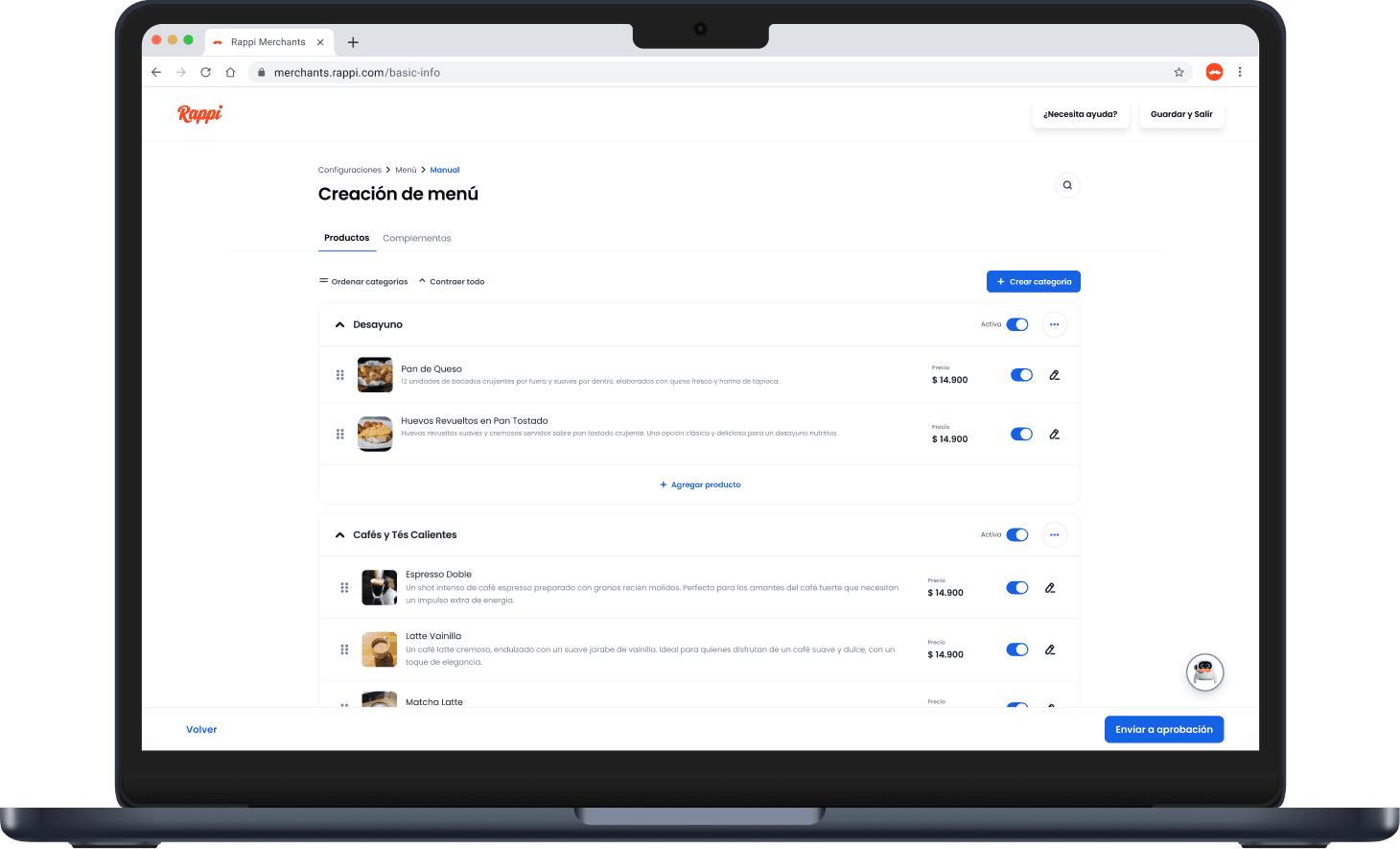
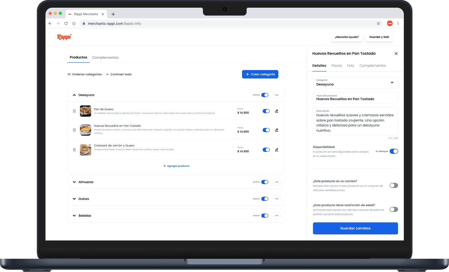
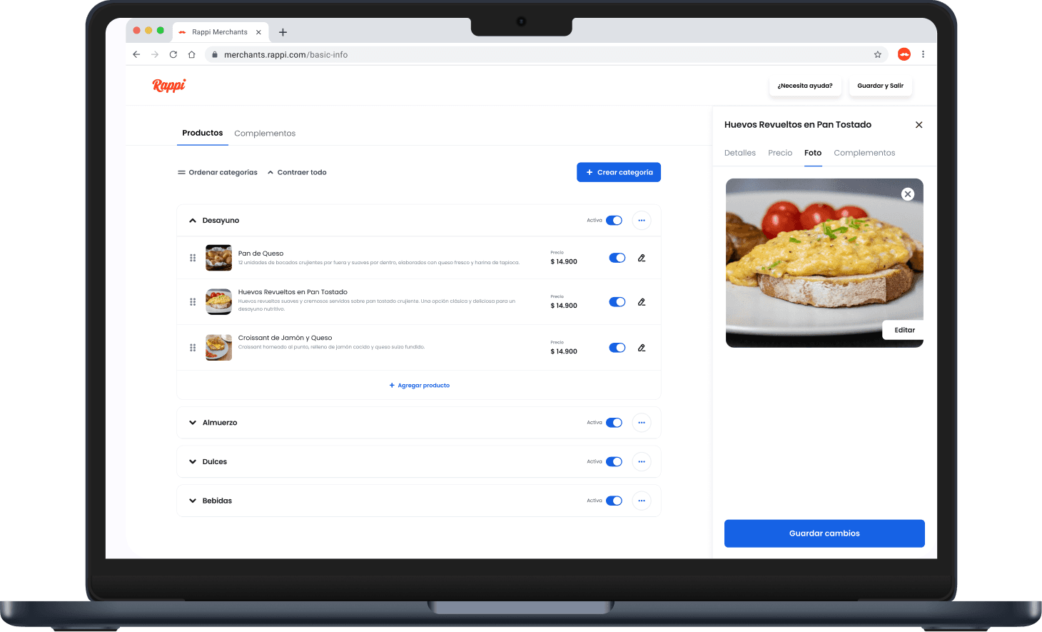
08 — The catalog problem
Menu management went from
days to a few hours.
The old catalog was a flat list with no category overview, no bulk actions, and editing opened a modal that hid everything else. Inspired by iFood's reusable complement groups and DoorDash's side panel, I redesigned it: collapsible categories, drag-to-reorder, a side panel that keeps the full menu visible while editing, and complement groups created once and linked to multiple products. The last one was the key driver of going from 2 weeks to 2 days.
09 — Outcomes
Tracked via Amplitude conversion funnels
Time to open a store
2 weeks
→
2 days
From sign-up to first order, across all 3 markets
10 — What I learned
01
Segment your metrics.
E2E conversion masked the real issue. Segmenting by step revealed the menu as the bottleneck — without that, we'd have optimized the wrong thing.
02
Fix first, redesign later.
3 releases instead of a 6-month redesign. Value from week 1. Shipping taught us more than planning ever would have.
03
Mobile-first wasn't obvious.
Stakeholders assumed desktop. 50% of merchants used phones. Mobile-first closed a gap that would have undermined the whole redesign.
04
Multi-country research was non-negotiable.
CO ≠ MX ≠ BR. Testing across all three upfront prevented building for one market and reworking for the others.